
Like fashion, graphic design trends are cyclical, and the design zeitgeist is constantly casting its eye back to decades past to find inspiration and give new twists to old styles.
We recently covered the 1960s trends that continue to echo through the ages, influencing the designs of the twenty-first century. Today, we’re taking a trip even further down memory lane — to the 1950s.
The 1950s was a time of prosperity, particularly in the US and Western Europe, following the end of World War II. It heralded the birth of modern consumerism, the ‘American Dream’ ethos, and teen culture, spearheaded by rock ‘n’ roll idols like Chuck Berry and Elvis Presley.
In the world of fashion and design, the decade was notable for its unique styles (like poodle skirts and greaser fashion) and the popularity of modernist design in architecture and interior design. In graphic design, it was characterized by its bold colors and geometric shapes.
Despite the current return to grungy Y2K styles, the 1950s remains a point of reference and a treasure trove of inspiration for today’s graphic designers. Make sure to save any of your 1950s design inspiration in a dedicated Playbook board and show us by tagging @playbook_hq on Instagram.
Join us as we look back on the movements, styles, and artists of the decade that profoundly altered the world of graphic design.
What was the style of graphic design in the 1950s?
The 1950s were a transformative period in graphic design, marked by the emergence of new styles and the incorporation of modern technology. Here’s an overview of the key aspects of graphic design during this era:
1. The rise of minimalism
During the 1950s, minimalism emerged as a dominant trend in response to the excess and ornamentation seen in previous decades. As a result, designers began embracing more straightforward, clean compositions that focused on simplicity and functionality.
This minimalist approach often used strong, geometric forms, clean lines, and primary colors, marking a departure from the more detailed and decorative designs that preceded it.
The focus was on creating visually compelling work that communicated its message quickly and clearly, reflecting the fast-paced, modernizing society of the time.
Paul Rand was a pioneering figure in American graphic design known for his innovative and minimalist approach. He believed in the power of simple, clean design and was influential in introducing the principles of the Swiss Style of graphic design to the United States.
His work in the 1950s included iconic logo designs for companies such as IBM, ABC, and UPS, characterized by their bold, simple forms and limited color palettes.
Rand’s approach to design was grounded in the belief that an effective design should be both aesthetically pleasing and functional — a philosophy that made him a leading figure in the development of modernist graphic design in America during this period.

Incorporation of photography
The 1950s also saw a pivotal shift from traditional illustration-based designs to those incorporating photography — partly driven by advancements in printing technology and the growing accessibility of photographic equipment.
Photography allowed for a more realistic and immediate representation of subjects, adding a new layer of authenticity and dynamism to graphic design and enabling designers to experiment with new techniques — such as photomontage — and blend photographic elements with graphical ones, creating a more layered and sophisticated visual language.
Saul Bass — often celebrated for his work in motion picture title sequences, poster designs, and corporate logos — pioneered an approach to graphic design that frequently incorporated photography, especially in his advertising work.
Bass’s innovative style blended photographic elements with bold typography and striking, simplified graphic forms. This approach was particularly evident in his film posters, where he often used photography in a highly stylized manner.
His work showcased his skill in merging photographic elements with other graphic components to create visually striking and communicative designs. His contribution to graphic design remains influential, with his techniques involving photography inspiring generations of designers.
The early days of Pop Art
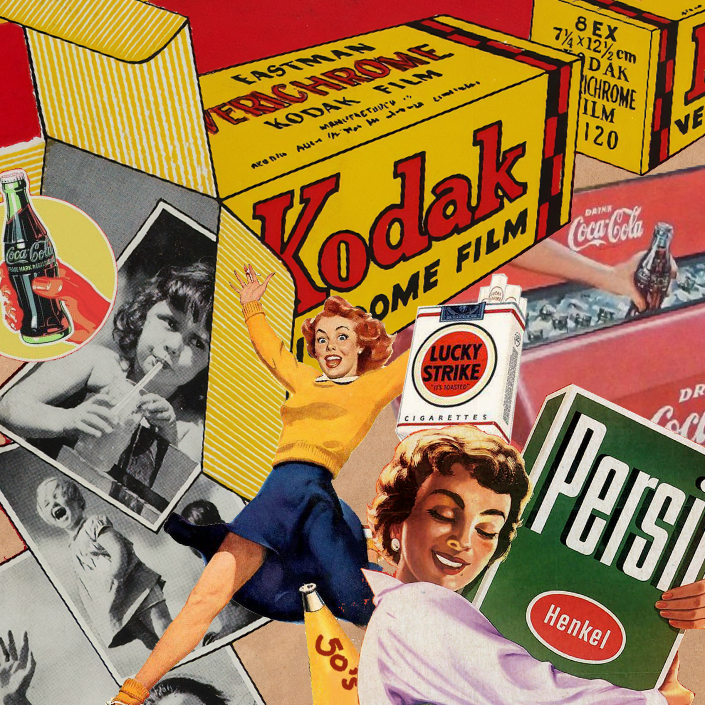
The early stages of the Pop Art movement, which would become prominent in the 1960s, began influencing graphic design in the 1950s. This movement was characterized by its focus on popular culture and mass media, often incorporating elements from advertising, comic books, and mundane cultural objects.
In graphic design, this translated to a bolder, more colorful aesthetic that often played with irony and parody. The influence of Pop Art can be seen in the way designers of the 1950s started to use popular imagery and consumer culture as part of their design vocabulary.
Richard Hamilton was an influential designer in the early stages of the Pop Art movement during the 1950s. While not exclusively a graphic designer, Hamilton’s work in various mediums, including design, painting, and collage, significantly contributed to the development of Pop Art.
Richard Hamilton is best known for his 1956 collage titled “Just what is it that makes today’s homes so different, so appealing?” This piece is often cited as one of the earliest works of Pop Art, and it incorporated elements from American advertising, magazines, and television — reflecting the burgeoning consumer culture of the 1950s.
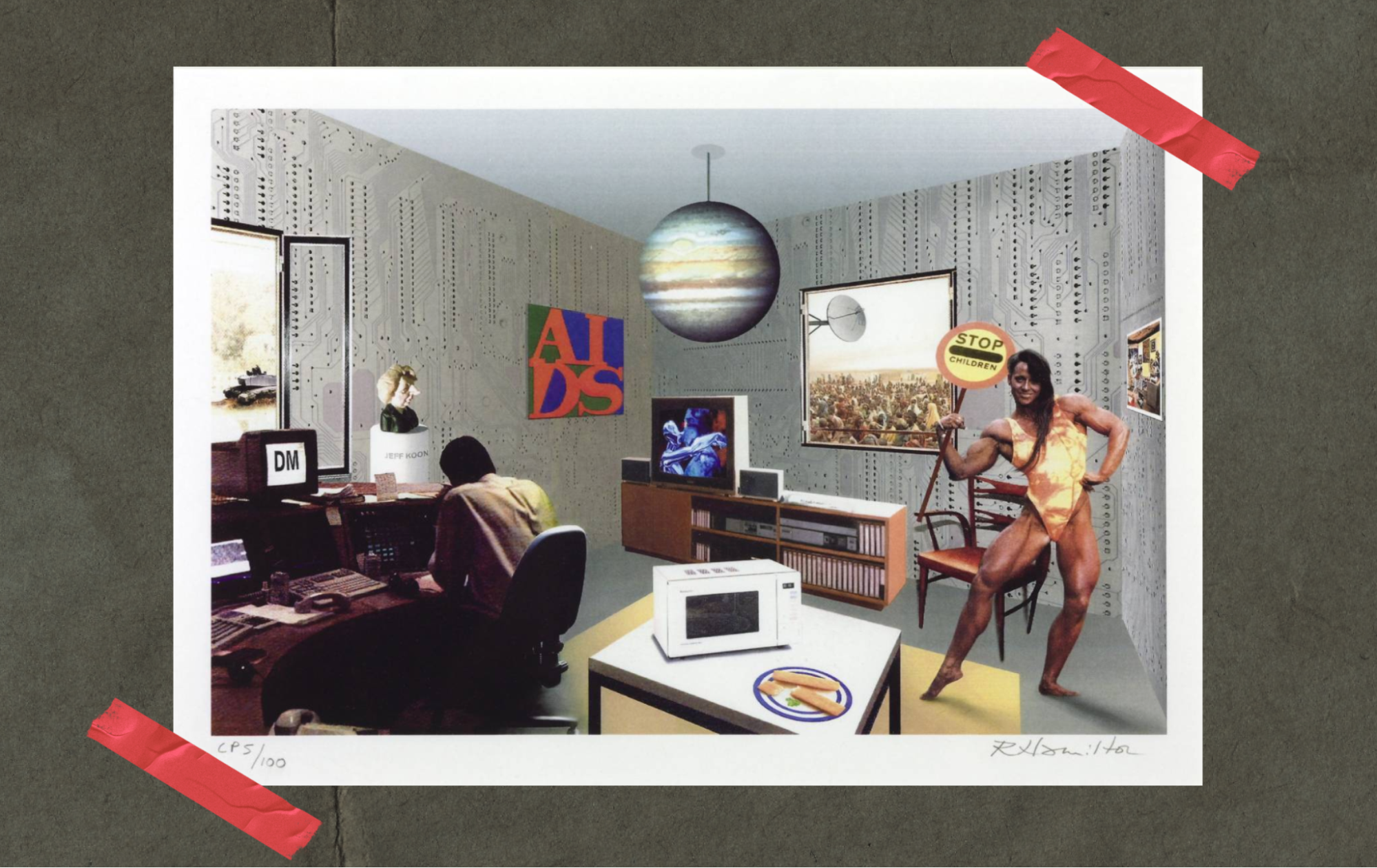
Hamilton’s work showcased a fascination with popular culture, mass-produced goods, and the imagery of advertising — all of which would become key themes in the Pop Art movement.
His approach to blending commercial art, design, and fine art was groundbreaking and helped blur the boundaries between these disciplines, while laying the groundwork for the Pop Art movement.
The impact of technological advancements
The 1950s was a period of significant technological advancements. New printing techniques, such as offset lithography, became more widespread, allowing for higher quality prints and a greater range of colors and textures, and expanding the possibilities for designers, enabling more intricate and vibrant designs.
Herbert Matter was a notable designer from the 1950s who worked with new printing techniques. He was a Swiss-born American photographer and graphic designer, known for his pioneering use of photomontage in commercial art. His innovative approach to design and photography was significantly influenced by the new printing technologies of his time.
Matter was adept at using the latest printing techniques to enhance the visual impact of his work. He was particularly known for his work in the field of advertising, where he applied advanced photographic and printing methods to create strikingly modern designs.
His approach often involved experimenting with scale, color, and the juxtaposition of photographic elements, pushing the boundaries of what could be achieved with the printing technology available during the 1950s.
His work not only contributed to the evolution of graphic design and photography, but also helped popularize these new printing techniques, demonstrating their potential for creating compelling designs in advertising and other commercial applications.
Contrast with traditional tools
Despite the advancements in tech, traditional tools and techniques — such as hand-drawn illustrations — continued to play a vital role in graphic design in the 1950s.
Many designers balanced the use of new technologies with traditional methods, creating a unique blend of the old and new. This juxtaposition is a hallmark of the era’s design, reflecting a period of transition and experimentation.
One pioneering graphic designer known for blending traditional and modern techniques is Lester Beall, whose work from the 1930s through the 1950s significantly influenced the visual language of American graphic design.
Beall successfully merged traditional design elements with emerging modernist trends. He was known for his innovative use of photomontage, typography, and bold color, which were considered modern techniques at the time.
At the same time, he maintained elements of traditional graphic design, such as hand-drawn illustrations and a strong sense of composition and balance. His ability to synthesize these different approaches made his work stand out and contributed to the evolution of graphic design as a profession.
Beall’s designs were not only visually striking but also effective in communicating complex messages, making him a key figure in the development of graphic design during this era.
Just as the technological breakthroughs of the 1950s sparked a surge of artistic innovation, modern tools like Playbook are empowering today’s creatives to push boundaries and explore new possibilities. With cutting-edge features like AI integrations, SearchGPT, as well as our Imagination Fund (designed to provide funding for creators to bring their visions to life) Playbook is redefining what’s possible in the world of creativity.
Notable graphic designers of the 1950s
Rand, Bass, Hamilton, Matter, and Beall are just some of the designers who influenced graphic design in the 1950s. Let’s explore three of the other creative minds who shaped mid-century style and design.
1. Cipe Pineles
Cipe Pineles — Art Director of Condé Nast from the 1930s to 1960s — was a graphic designer whose style and influence played a significant role in shaping 1950s design.
Born in Austria and raised in the United States, she became one of the first female art directors in the predominantly male world of American magazine publishing and a trailblazer for women in the design industry.
By breaking through gender barriers, she became a role model and mentor for future generations of female designers. Her work, reflecting an acute awareness of cultural trends and social changes, particularly in addressing the modern woman, solidified her status as a key figure in 20th-century graphic design.
Known for her dynamic integration of hand-drawn illustrations with typography, she brought a lively and personal touch to her layouts, in a technique that was quite revolutionary at the time.
Pineles’ use of bold and imaginative color palettes made her designs stand out, adding vibrancy and visual appeal. As the art director for influential magazines, like Seventeen and Charm, Pineles transformed the visual approach to women’s magazines, ensuring that her designs not only resonated with her audience but also reflected the interests and aspirations of the modern woman.

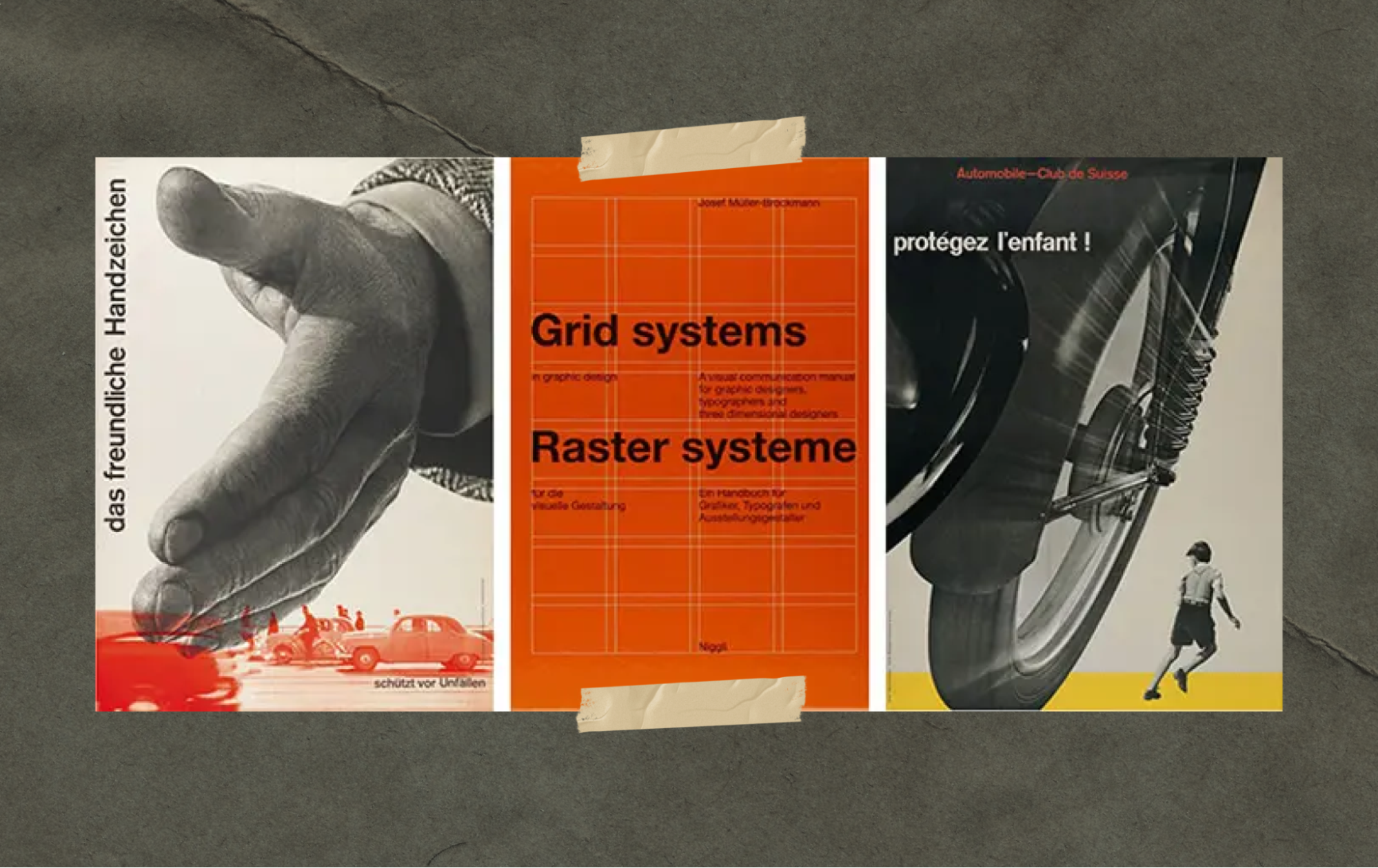
2. Josef Müller-Brockmann
A Swiss graphic designer and teacher, Josef Müller-Brockmann is renowned for his work in developing and promoting the Swiss Style of graphic design, also known as the International Typographic Style.
A rigorous grid system, clean sans-serif typography, and a strong focus on clarity and simplicity characterized his work. Müller-Brockmann’s designs, especially his concert posters and corporate identities, were exemplary in their minimalist approach and their use of geometric forms.
His commitment to functional, objective, and universally understandable graphic communication had a profound influence on graphic design from the 1950s onwards, shaping the course of modern design.
Additionally, as an educator and writer, his teachings and publications spread these principles widely, impacting generations of designers around the world.
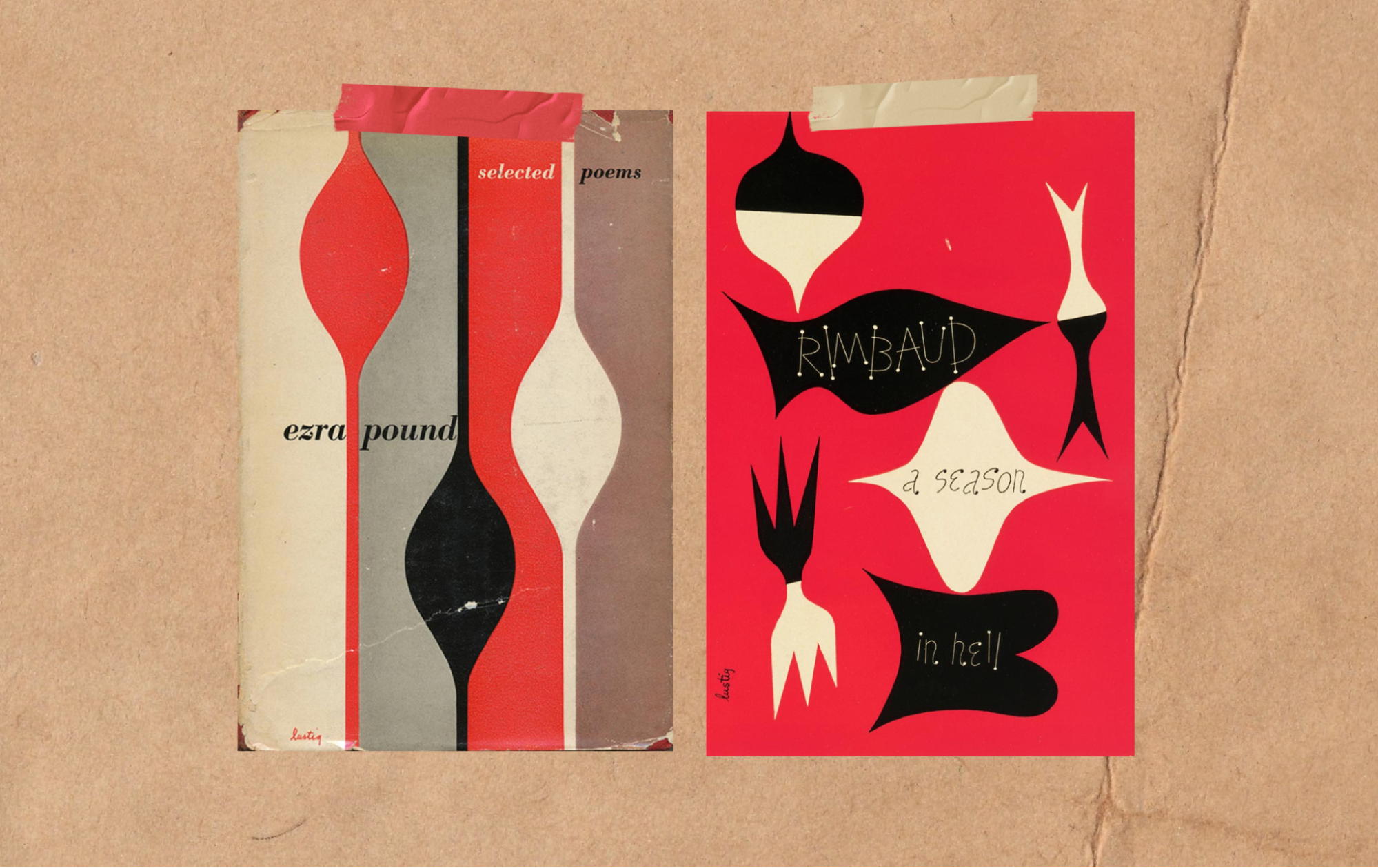
3. Alvin Lustig
An American graphic designer, Alvin Lustig was known for his innovative and diverse work in the mid-twentieth century. He made significant contributions in various areas of design, including book covers, corporate identities, and interior designs.
Lustig’s style was characterized by its abstract forms and use of vivid colors. He was a pioneer in integrating modern art into commercial design, creating work that was both avant-garde and widely accessible. His book covers, in particular, are celebrated for their imaginative and symbolic approach.
1950s graphic design in the 21st century
The design ethos of the 1950s continues to shape graphic design trends today, and modern graphic design often reflects the minimalist principles, clean typography, and grid-based layouts that were hallmarks of the 1950s. The era’s focus on clarity, simplicity, and the integration of typography with other design elements remains a crucial lesson for today’s designers.
Recently, there’s been a noticeable trend of incorporating mid-century design elements into modern projects, blending vintage charm with contemporary sensibilities.
This includes the use of retro color palettes, vintage-inspired typography, and mid-century illustrations, creating designs that resonate with both nostalgia and modernity.
For modern designers, the 1950s offer invaluable insights, and drawing inspiration from this decade can help you create designs that are fresh and familiar, while also simple and impactful.
Take a look at how some of Playbook’s community members incorporate 1950s influences into their work.
1. Yannis Guibinga
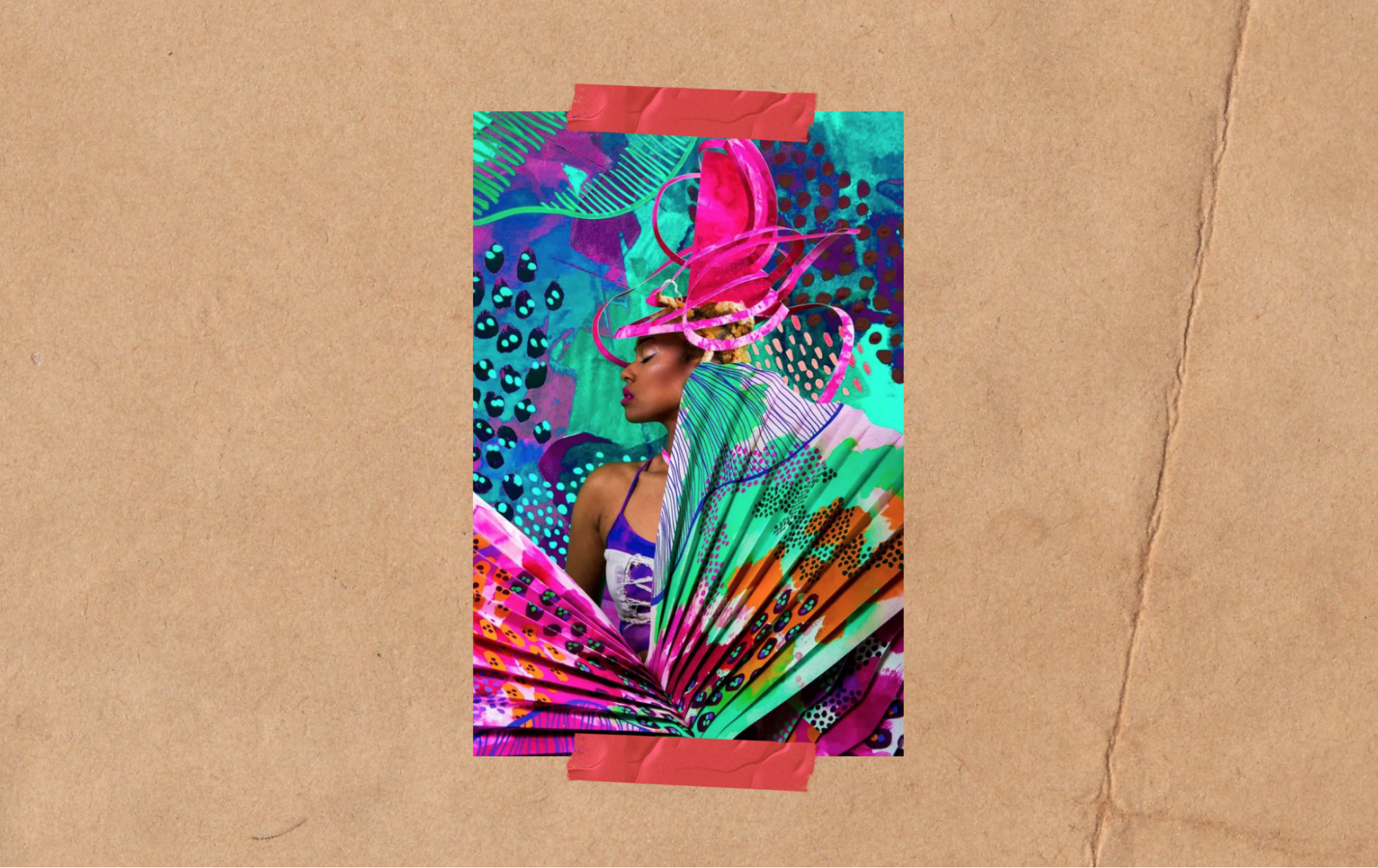
Yannis Guibinga takes cues from 1950s design trends like abstract expressionism and mid-century modern in this image with bold, punchy colors and playful patterns that channel the experimental vibe of that era.
Plus, the mix of organic shapes and geometric elements with photography feels mid-century modern, which was all about finding that balance between natural flow and bold abstraction.
2. Ademola Oladipo

Ademola Oladipo reflects 1950s influences through their bold use of color and lighting, reminiscent of the vibrant palettes seen in mid-century pop art and abstract expressionism.
The staged composition and playful incorporation of everyday objects, like the watering can and flowers, nod to the era’s experimental approach to art. The balance between graphic, structured elements and an overall surreal, dreamlike vibe ties back to the mid-century focus on pushing creative boundaries.
3. Gabrielle Rennuit

Gabrielle Rennuit channels 1950s inspiration in this collage-style layout, which was a hallmark of post-war art movements like abstract expressionism and pop art. The cut-out photographs, bold shapes, and mix of textures feel reminiscent of the experimental, handcrafted techniques popularized during that time.
It also echoes the mid-century fascination with blending fine art and mass media, where magazines and everyday visuals became central to artistic expression. The messy, tactile arrangement captures the raw creativity and DIY ethos of the era.
4. Matthieu Quatravaux

In this photo, Matthieu Quatravaux draws on 1950s influences — with their surrealist undertones and the use of everyday objects as art. The chaotic arrangement of industrial materials and repurposed items reflects the mid-century fascination with assemblage art — a movement that transformed discarded objects into thought-provoking compositions.
The figure’s paper-bag mask adorned with flowers brings a playful yet unsettling element, reminiscent of the surrealist focus on dreamlike, symbolic imagery. Overall, it captures the experimental and boundary-pushing spirit of 1950s art movements.
Embracing the past: the enduring influence of 1950s design
The 1950s was a formative period in the history of graphic design, and its influence is still evident in the 2020s. Contemporary designers draw on the era’s minimalist principles, typographic excellence, and grid-based layouts, often infusing them with modern trends and technologies.
The ongoing revival and nostalgia for 1950s aesthetics provide a rich source of inspiration, while the era’s foundational design principles continue to offer valuable lessons for creating impactful, enduring work in today’s ever-evolving design landscape.
Looking for more resources, inspiration, and support on your graphic design journey? Join the Playbook Community to explore competitions, giveaways, and Playbook design boards that can help push you beyond your limits to create your best work. Check out our tutorials to learn more.