
The background of your artwork is where your story unfolds, setting the tone, complementing the main subject, and adding depth to your narrative.
You can use it to direct the viewer’s gaze to important details, convey the mood or ambiance, and organize information — all of which can enhance the impact of your work.
While a well-designed background can inspire awe and admiration, mastering the art of backgrounds can take time, practice, and perseverance.
If you’re looking for tips on how to improve your backgrounds, you’ve come to the right place.
In this tutorial, we’ll share the eight simple steps to creating compelling backgrounds that will elevate your art from ‘okay’ to ‘exhibit-ready.’ So, let’s get started!
1. Define the focus of your background
Before you dive into drawing, it’s crucial to define the purpose of your background. Are you trying to evoke a particular emotion, convey a message, highlight a character, or tell a story?
Consider your focus carefully, as it’s your first step towards a coherent and impactful artwork.
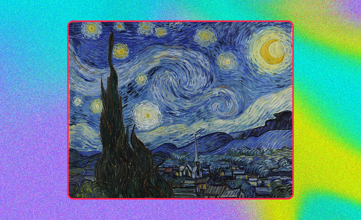
Take Van Gogh’s ‘Starry Night’ — an iconic painting that demonstrates how a background can elevate the overall composition. The swirling, vibrant sky creates a sense of movement and emotion, drawing the viewer in.
Meanwhile, the contrast between the dynamic, almost turbulent sky and the quiet, orderly village below adds depth to the narrative. Van Gogh’s use of color and brushstrokes in the sky captures the viewer’s attention, making the background as integral to the artwork as the foreground elements.
To define your focus, try the following brainstorming techniques:
Mood boards: Gather images that resonate with the atmosphere you’re aiming for. This could be anything from light source inspirations to color palettes.
Thumbnail sketches: These quick, small sketches are a great way to explore different layouts and perspectives.
Narrative considerations: How does your background support your character or story? A busy cityscape may set the pace for your manga comic, or a tranquil meadow for your illustration.
2. Understand perspective
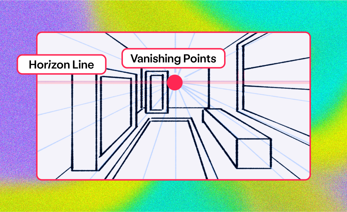
Perspective in drawings adds depth by creating an illusion of three dimensions on a two-dimensional surface through techniques like linear perspective, where parallel lines converge at vanishing points on the horizon line, giving a sense of depth and distance.
With this technique, objects closer to the viewer are larger and more detailed, while those farther away appear smaller and less detailed — replicating how the human eye perceives the world and making the artwork appear more realistic and engaging.
You can create perspective using vanishing points — points on the horizon line of the image that help create the illusion of depth. There are usually one, two, or three vanishing points — here’s how to use them:
One-point perspective: This involves a single vanishing point on the horizon line, and parallel lines in the scene converge at this point, creating depth. It’s often used for scenes where objects face the viewer directly, like a straight road or hallway.
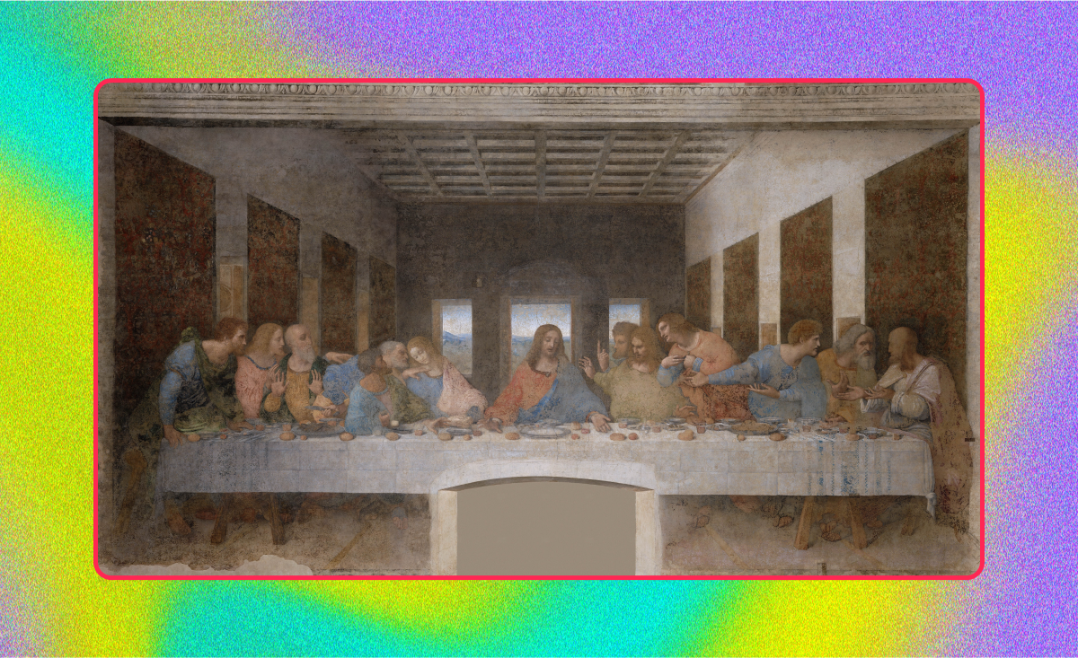
A notable example of one-point perspective in art is Leonardo da Vinci’s ‘The Last Supper.’ The single vanishing point of this masterpiece is right behind the head of Jesus, creating a strong focal point, while the orthogonal lines from the walls and ceiling of the room converge at this point, drawing the viewer’s eye directly to the central figure of Christ.
Two-point perspective: Here, two vanishing points, typically at the edges of the composition, create depth. This method is ideal for depicting objects at an angle, like a corner of a building.
A classic example of two-point perspective in art is Gustave Caillebotte’s ‘Paris Street; Rainy Day,’ which showcases two-point perspective through the use of two vanishing points, each located off the canvas on the horizon line.
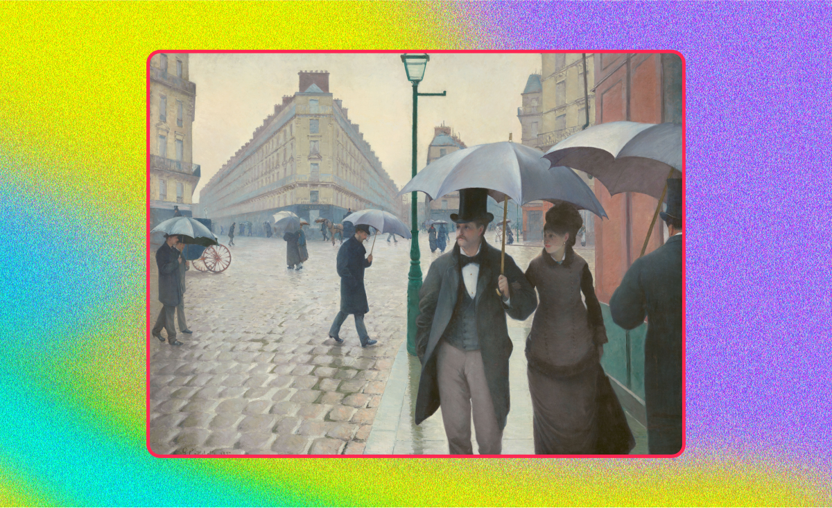
The orthogonal lines of the buildings and street converge toward these points, creating a realistic depiction of the urban landscape and enhancing the viewer’s sense of being part of the scene.
Three-point perspective: This adds a third vanishing point, usually above or below the horizon line, and is effective for dramatic compositions, like skyscrapers viewed from below or aerial perspectives.
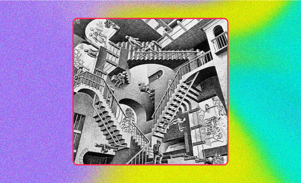
An exemplary artwork that demonstrates three-point perspective is M.C. Escher’s lithograph, ‘Relativity.’
Through the use of three vanishing points, Escher skillfully manipulates the perspective to create a gravity-defying world where stairs and architectural elements extend in various directions, blurring the lines between reality and illusion.
3. Study real-life environments
Great artists are great observers — studying real-life scenes enhances your ability to capture realistic forms, colors, and proportions and recreate environments with authenticity.
To improve your observation skills, practice sketching from life, paying attention to details like light, shadow, and perspective.
Spend time sketching different environments to understand their structure and composition, observing how elements like elevation changes and horizon lines interact in a natural setting.
Doing this will hone your technical skills while enriching your visual library — you’ll pick up on the random objects that can help to create a scene or tell a story, helping you create more convincing backgrounds.
4. Build the foundation
Now, it’s time to lay the groundwork — start by drawing a horizon line on a new paper. Positioning this line lower down adds dynamism to your scene, but you may want to place it in the middle or at the top, depending on the focus you decided on in Step #1.
Then, choose a vanishing point on this line. Imagine it as a sun, drawing outward rays to form the basis of a three-dimensional space — these lines will guide you in placing objects with accurate proportions.
Adding some light horizontal lines to further visualize the space will enhance the depth and perspective of your drawing.
5. Add depth and detail
Next, you can start blocking out the shapes of the main elements in your background drawing. Filling out the details with rough sketches helps you ensure the perspective and composition make sense and nothing looks off.
The most effective backgrounds use layers to draw attention to the main subject, which is usually in the midground, while details in the foreground (the part closest to the viewer) and background (the part furthest away) guide the viewer’s eye toward the subject.
Here are some additional tips and techniques for adding depth and detail to your art:
Textures: Experiment with different techniques to create textures that suit your artwork’s mood.
Light and shadow: Understanding how light affects a scene can be a game-changer in adding dimension to your work.
Atmospheric effects: Consider adding elements like fog or haze for an extra layer of ambiance.
6. Bring the background to life
To create impactful art, a basic grasp of color theory — which explains how different colors interact and the emotions they evoke — is essential.
For instance, warm colors like red and orange can create a sense of energy, while cool colors like blue and green can induce peace and tranquility. Knowing the purpose or message of your art and combining it with color theory can help you achieve the desired effect.
Another concept, color harmony, is equally influential in your color combination choices. In general, color schemes are either complementary or analogous.
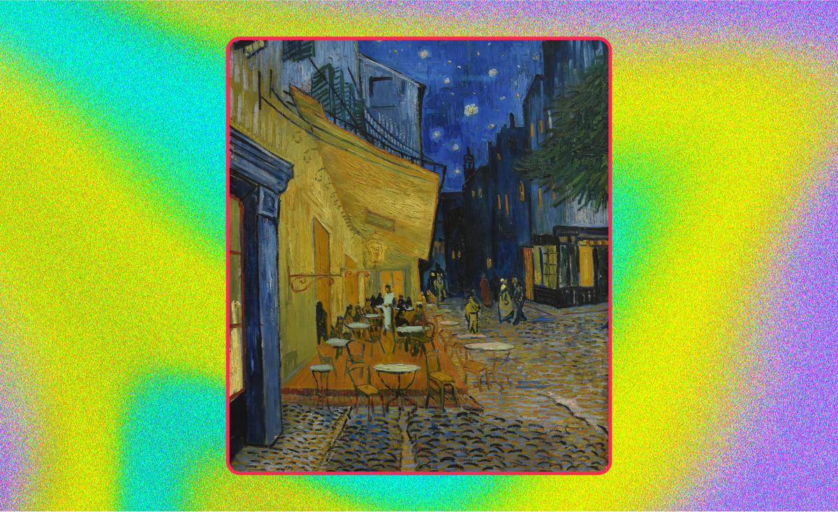
Complementary color schemes involve colors that are opposite each other on the color wheel, such as blue and orange or red and green. This offers high contrast and vibrancy, making it a good choice for pieces that aim to make a bold statement, grab attention, or add excitement and drama.
For example, with its blue and yellow color scheme, Van Gogh’s ‘Café Terrace at Night’ creates a striking contrast that conveys a lively atmosphere.
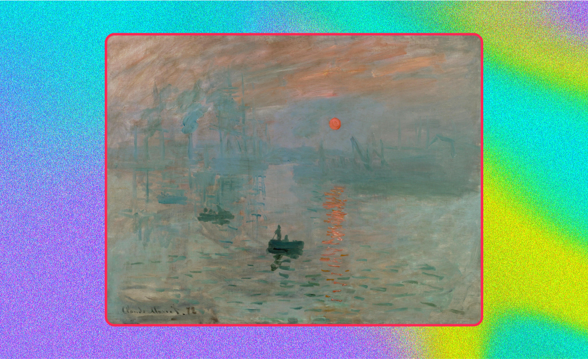
In contrast, analogous color schemes use colors that are next to each other on the color wheel, like red, orange, and yellow. This creates a harmonious and visually cohesive look that provides a soothing visual experience.
Claude Monet’s ‘Impression, Sunrise’ is a great example of an analogous color scheme, with its shades of oranges, reds, and yellows that capture the essence of a sunrise over a harbor and the soft early morning light.
As you apply your colors, it’s essential to do so gradually through careful layering and blending that create depth and smooth transitions.
7. Experiment with different styles
Developing a unique artistic voice takes time, practice, and experimentation, and exploring different techniques and styles can help you find the best way to express your individual take on the world.
There is a wide variety of background types to try, including:
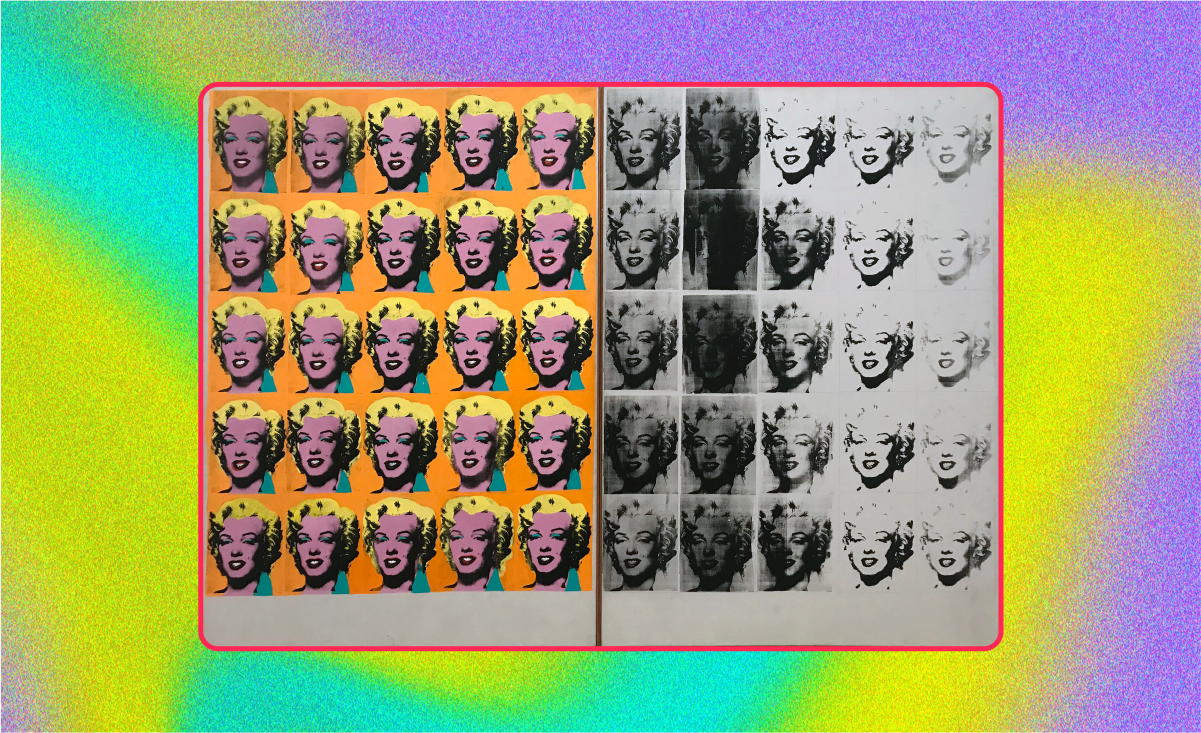
Solid color backgrounds provide simplicity, such as Andy Warhol’s ‘Marilyn Diptych,’ which uses a solid color background to highlight the central figure.
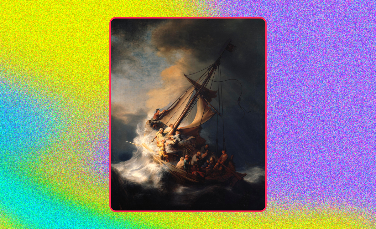
Textured backgrounds give depth, like Rembrandt’s ‘The Storm on the Sea of Galilee,’ where the stormy sea and dark sky add a tense and dramatic atmosphere.
Gradient backgrounds, like Georgia O’Keeffe’s ‘Sky Above Clouds IV,’ with its beautiful gradient from light to dark hues, can create a dynamic feel.
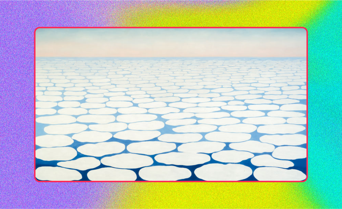
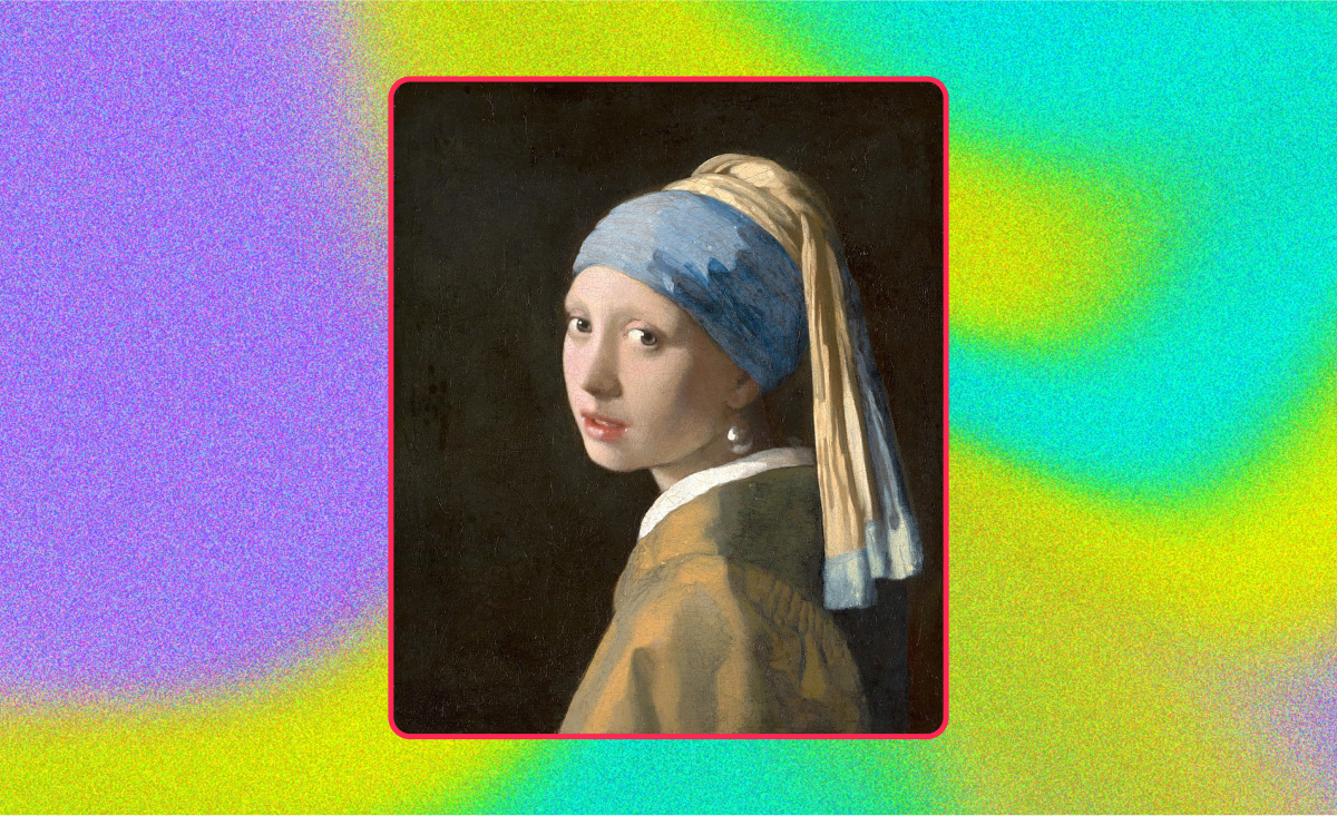
Image backgrounds provide realism, as seen in Johannes Vermeer’s ‘Girl with a Pearl Earring,’ where the detailed image background complements the subject.
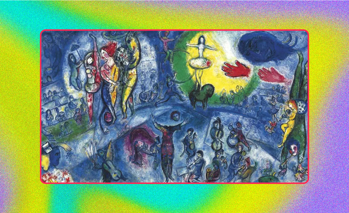
Transparent backgrounds can create a sense of depth and fantasy through layering, as exemplified by Marc Chagall’s dreamlike creations.
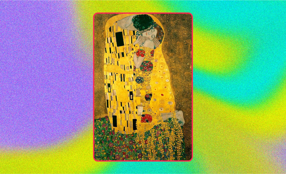
Pattern backgrounds offer visual interest — think of Klimt’s ‘The Kiss’ and its intricate patterned background.
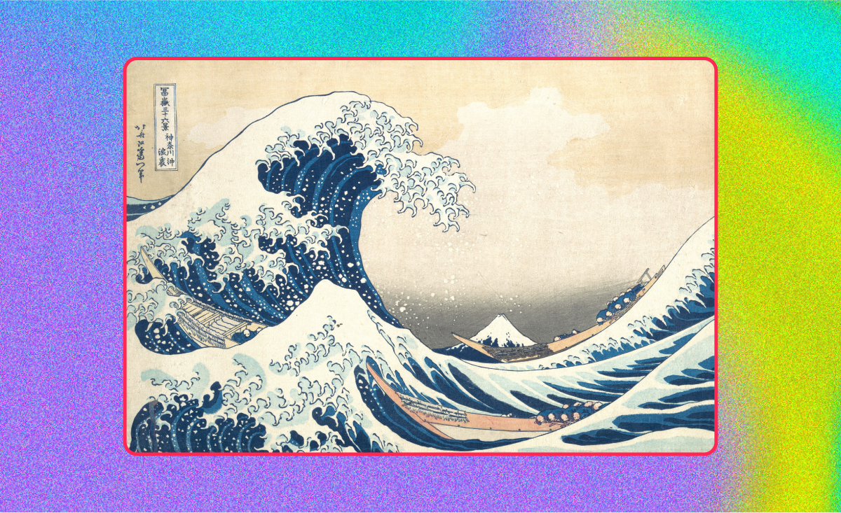
Illustrated backgrounds tell a story, like Hokusai’s ‘The Great Wave off Kanagawa,’ where the background is as iconic as the foreground.
White backgrounds create a minimalist effect, like Rauschenberg’s ‘White Paintings,’ with their white backgrounds that focus the eye on texture and shadow.

Craft backgrounds that tell a story
Remember, creating stunning backgrounds takes practice and patience. It’s about experimenting, learning, and growing as an artist — but you don’t have to go it alone!
At Playbook, we understand the artist’s journey and have a wealth of resources to support your growth — from our free illustrations to the Playbook Community!
Looking for more guidance on creating depth and perspective?
Check out this guide on how to create depth in graphic design.
And be sure to get some inspiration for your portfolio by checking out our excellent design templates.