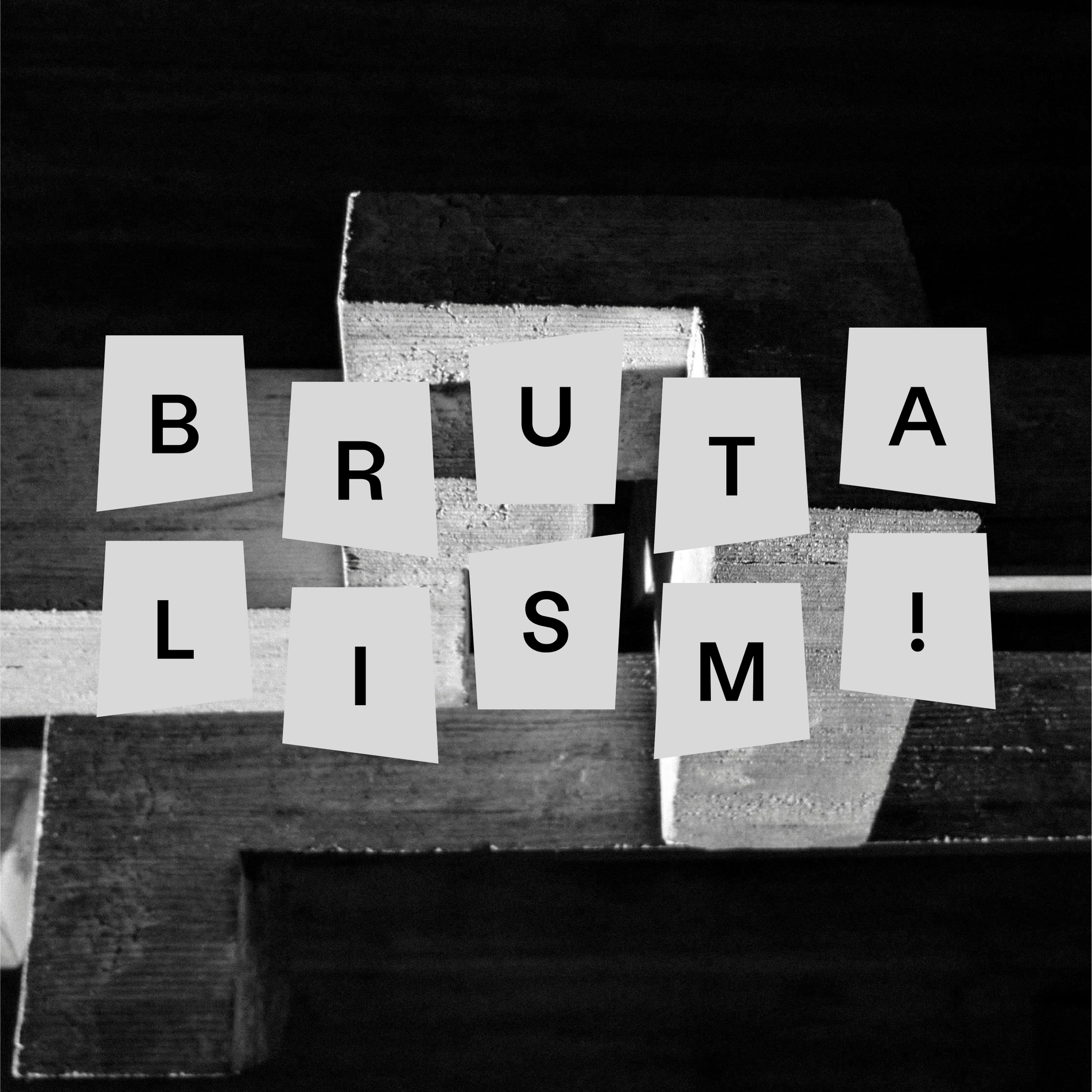
Although its roots are firmly rooted in architecture since its emergence in the mid-20th century, brutalism is a style that’s also punctuated the graphic design scene throughout the decades.
Brutalism is characterized by its commitment to the minimal: exposed concrete, geometric shapes, gray and neutral color schemes and angular lines. The term ‘brutalism’ itself comes from the French "béton brut," which means "raw concrete." Architectural critic Reyner Banham took this phrase and gave it a playful twist, reflecting the initial shock this style often caused.
In recent years, brutalism enjoyed a renaissance as a go-to style for many designers.
But what’s the history behind this bold (and often controversial) movement? And–more importantly–how can you embed some of its ideas into your graphic design?
A brutal background: The historical background of brutalism
Though the buildings themselves have a distinctive appearance, brutalism was (and is) about more than just the aesthetic appeal. During its rise in the ‘60s and ‘70s, it was the embodiment of a philosophy that championed functionality and social responsibility in design.
Celebrated architects, like Alison and Peter Smithson, were key champions of the brutalist approach, advocating for the use of exposed concrete to showcase the structural beauty and rawness of buildings.
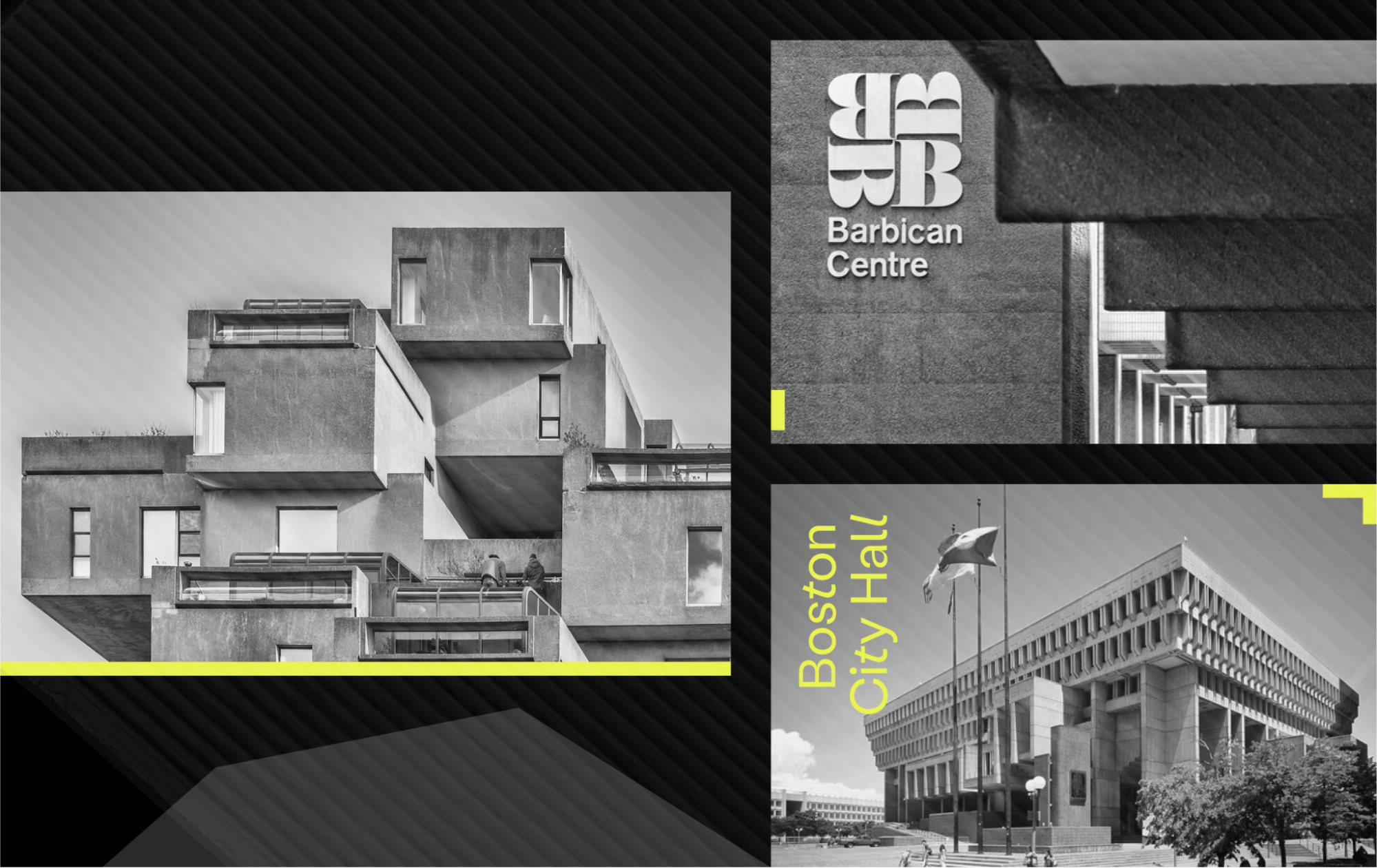
Many of these relics remain around the world, with some of the most imposing and iconic buildings showcasing brutalist architecture. These include Boston City Hall, the Barbican Centre in London, and the Habitat 67 housing complex in Montreal, Canada.
Given its association with imposing concrete structures and its raw aesthetic, it perhaps comes as a surprise that brutalist design cues have made their way into graphic and digital design. Yet many famous posters, pop culture pieces and websites have this movement to thank for their standout nature.
Here are some of the distinctive features of brutalism in graphic design:
- Raw textures: Brutalism embraces imperfections, using textures like distressed paper or grungy brushstrokes to add a sense of authenticity.
- Bold typography: Big, impactful typefaces take center stage, often sans-serif and sometimes hand-drawn, demanding attention and conveying a strong message.
- Asymmetry: Brutalism throws order out the window, using asymmetry to create dynamic compositions and challenge expectations.
- Monochrome palettes: Brutalism often leans towards black, white, and shades of gray, creating a bold and sometimes stark contrast that emphasizes content.
- Functionality first: Like their architectural counterparts, brutalist designs prioritize function over decoration. Elements are stripped down to their core purpose, creating clarity and a direct visual language.
Brutalism vs. convention
Compared to other (arguably) more traditional design styles, brutalism stands out:
- Minimalism vs brutalism: While minimalism seeks sleekness and simplicity, brutalism embraces rawness and texture through exposed brick and concrete.
- Modernism vs. brutalism: While modernism emphasizes form and function, brutalism adds a layer of social commentary and emotional impact. Think sleek towers vs. imposing housing projects.
- Swiss Style vs. brutalism: Where Swiss Style prioritizes grid-based layouts and neutrality, brutalism embraces asymmetry and challenges norms. Think clean typography vs. bold, distorted fonts.
- Art deco vs. brutalism: Perhaps the most stark difference, art deco exudes elegance with luxury materials like marble and gold, where brutalism champions raw materials and functionality over aesthetics.
All of these styles bring their own benefits, but the stark characteristics of brutalist designs mean it rejects the idea of polish and perfection in place of honesty and boldness.
Elements of brutalist graphic design
When it comes to graphic design, that sense of making a statement remains front and center in brutalism. Let's delve into the key elements that define this unique style:
Typography and font
Brutalism demands attention with stark, often oversized typography. Sans-serif fonts come to the fore, with bold, geometric shapes and unconventional forms grabbing the viewer's eye.
Imagine hand-drawn, distressed letters or pixelated fonts, challenging established notions of beauty. Graffiti sprayed across a concrete wall is the perfect example.
Color schemes and textures
Brutalist designs often stick to a monochromatic palette, favoring black, white, and shades of gray. But it's not just about neutrality; stark contrasts can also have maximum impact.
Texture is important too, with distressed paper, rough brushstrokes, and even concrete textures adding a layer of rawness and authenticity.
Layout and composition
Brutalism throws traditional grids out the window, embracing unconventional, often jarring layouts. Think overlapping elements, asymmetrical arrangements, and unexpected juxtapositions.
Imagine text spilling across the page, images cut off at odd angles, or elements defying the design norms. It's a deliberate disruption, challenging how we visually consume information.
Nemanja Janjic, from Tunel Studio, says: “I find brutalism engaging because it challenges conventional aesthetics. It's a style that demands attention and evokes strong reactions, often leaving a lasting impression. By using stark, robust forms and a minimalistic approach, my designs stand out in a world saturated with polished and overly refined visuals. Brutalism sends a message, it creates impact.”
Imagery and graphics
Brutalism uses raw, unpolished images and graphic elements. For example, grainy photographs, bold geometric shapes, and even distressed textures incorporated directly into the visuals.
Imagine found photography with rough edges, vector graphics with intentional glitches, or abstract shapes reminiscent of concrete imperfections. It's all about rawness and honesty, conveying the message with blunt authenticity.
These elements, combined, create a design language that's bold, impactful, and unafraid to challenge conventions.
Examples of brutalism in graphic design
There are many famous and iconic examples of brutalist-inspired graphic design works. Here are some of our favorites:
1972 Munich Olympics posters
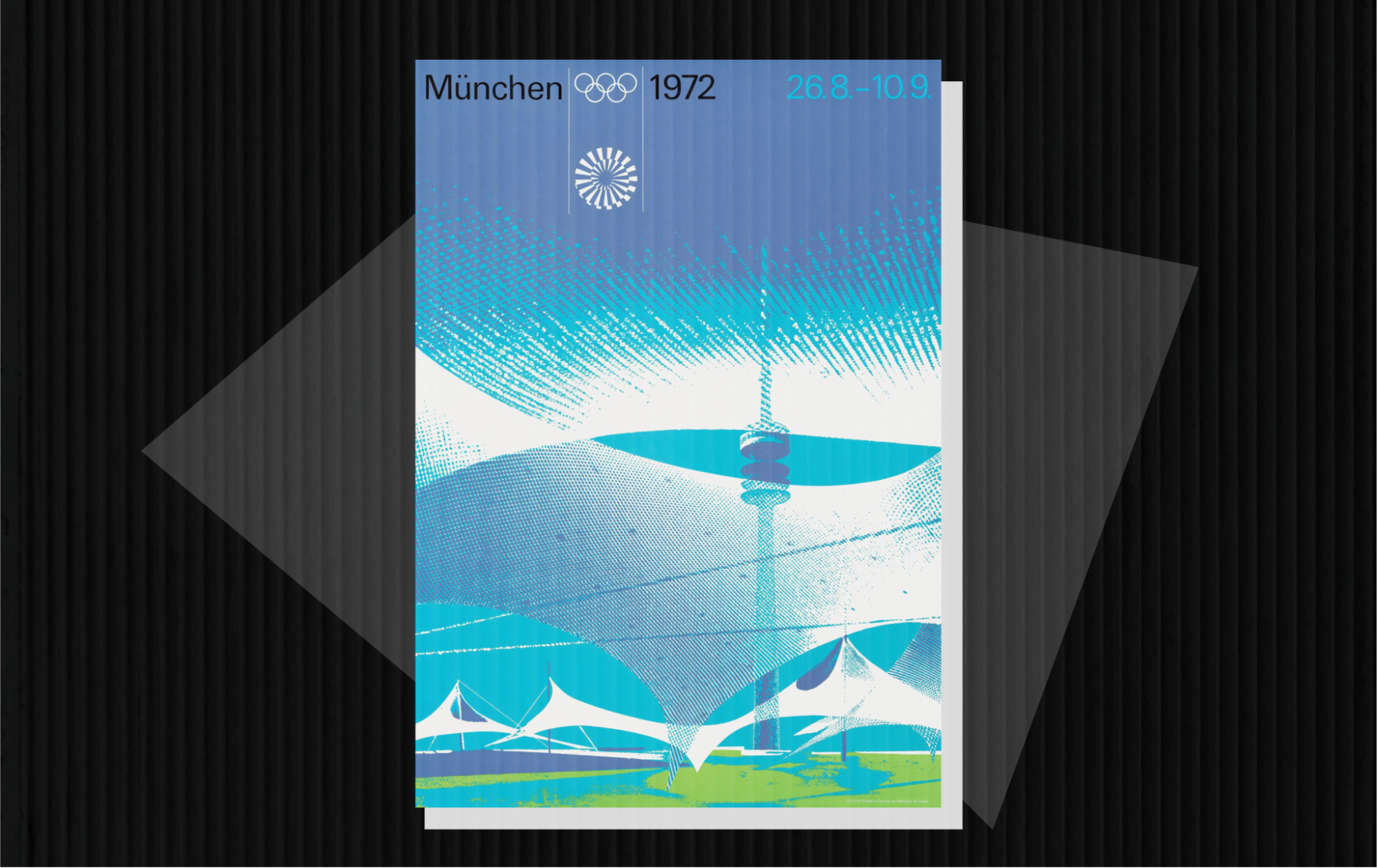
These bold and geometric posters, designed by Otl Aicher, used unconventional layouts and vibrant colors to represent the different Olympic disciplines. They challenged traditional design norms and remain some of the most recognizable Olympic visuals ever created.
The Beatles' White Album cover
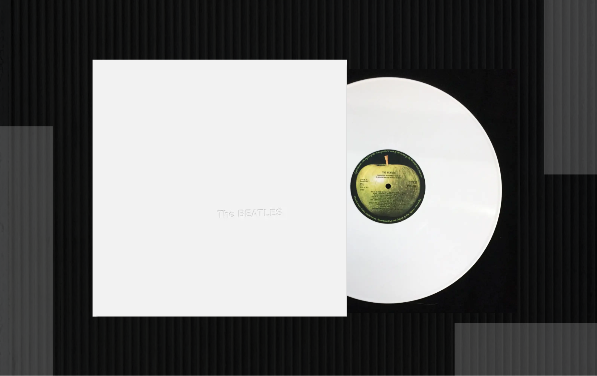
The iconic cover, designed by Richard Hamilton, perfectly embodies the starkness and simplicity of Brutalist principles. The white canvas features just the band's name embossed in sans-serif type, creating a powerful and almost unsettling visual.
The Adidas logo
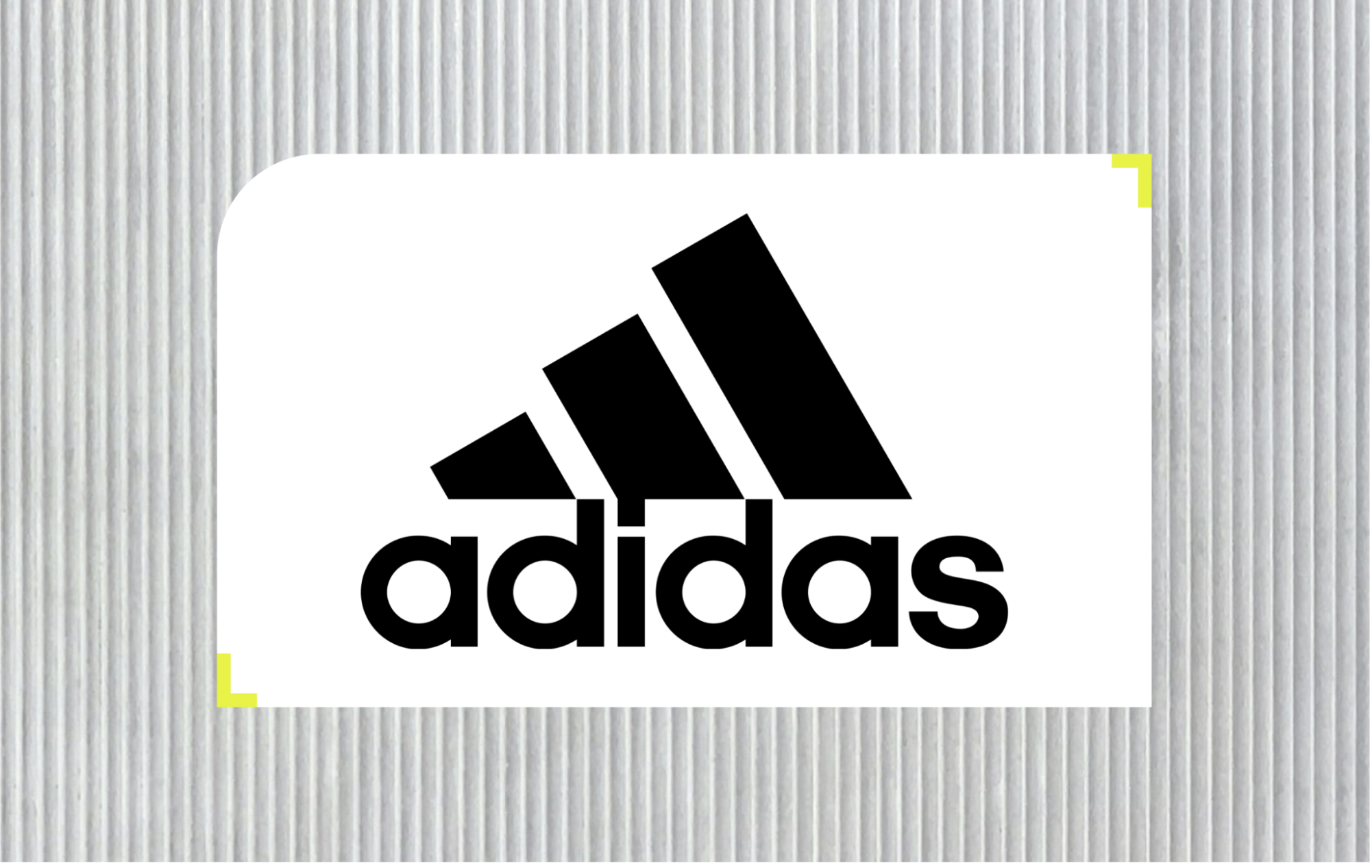
The sportswear company’s iconic logo, with its three bold stripes and contrasting black and white colors, could be considered an example of brutalist graphic design. While not as raw or unconventional as some other examples, it embodies the style's emphasis on simplicity, functionality, and visual impact.
Obama’s 2008 Presidential campaign posters
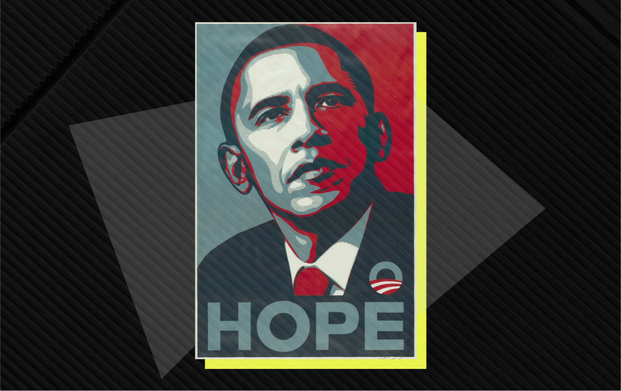
Some of the posters used in Barack Obama's 2008 presidential campaign, designed by American artist Shepard Fairey, incorporated elements of brutalism, particularly in their use of stark typography, limited color palettes, and bold imagery.
Implementing Brutalism in design projects
So, as a designer, how can you implement brutalist elements into your projects? Here are some tips:
- Getting started with brutalism: Offer practical tips for beginners to start experimenting with brutalist design elements. For example:
- Embrace raw elements: Brutalist design celebrates the inherent beauty of materials, often showcasing them in their unrefined state — e.g., exposed concrete textures, raw wood grains, distressed paper surfaces — to create depth and visual interest.
- Go bold with typography: Brutalist fonts are loud and proud. Experiment with chunky sans-serif typefaces with strong geometric shapes (ditch the delicate serifs), letter spacing, and overlapping to create a dynamic and impactful typographic layout.
- Master the grid and break it: While brutalism often uses grids for structure, it also thrives on breaking free from them. Don't be afraid to play with unconventional layouts, overlapping elements, and asymmetrical compositions.
- Use color as your canvas: Brutalist color palettes tend to be limited and deliberate. Think monochromatic schemes, muted earth tones, and pops of bold accent colors. Use color strategically to highlight key elements and create a sense of contrast and hierarchy.
- Use texture: Brutalist design loves texture! Experiment with adding tactile elements like embossing, debossing, or even incorporating real-world materials like fabric or metal into your designs.
- Balance aesthetics and usability: Discuss the importance of maintaining a balance between brutalist aesthetics and functional design — consider how your designs can address issues or provoke thought beyond just looking cool.
- Experiment: The beauty of brutalist design lies in its raw and experimental nature. Don't be afraid to push boundaries, try new things, and embrace the happy accidents that come along the way.
And a final word from Nemanja: “Start with basic shapes and limited color palettes. The power of brutalism lies in its simplicity and directness. Each element should have a purpose, avoid unnecessary decorations that don't contribute to the message of the design (or to the functionality!). A big one is opt for heavy, impactful fonts. Brutalism is about making a statement, and the right typeface can be your loudest voice. Incorporate textures, whether it's rough, concrete-like backgrounds or grainy overlays. These kinds of textures can add an industrial feel to your designs.”
Free your inner design rebel with brutalist cues
Brutalism is a design style that certainly makes a statement. Its raw concrete aesthetic, bold typography, and unconventional layouts can challenge expectations and push boundaries.
So, if you’re a graphic designer seeking to cause a reaction, provoke thought, and break free from design norms, brutalism holds a unique and undeniable appeal.
Embrace the grit, experiment with textures, challenge layouts, and use typography that roars. Remember, brutalism isn't a rulebook, it's a starting point. Let your creativity guide you, and don't be afraid to push boundaries.
Looking to further embolden your portfolio? Create your portfolio with Playbook's templates today.