
We know how it goes. You’re finalizing your drafts for a specific graphic and now comes the most difficult part — choosing your colors. There’s no disputing the importance of choosing the right colors for your design. Specific colors can evoke certain emotions when we see them, and so choosing the right color palette is crucial to making sure that your images are saying what you want and need them to say. After all, a picture is worth 1,000 words.
While choosing your color palette can be one of the more difficult parts of graphic design, it’s also arguably the most fun. The right shades can help bring your work to life, resonate with your audience, and set the underlying tone for the rest of the content. Here, we’ll go through everything you need to consider when picking your color palette for graphic design.
What is color theory in graphic design?
Color theory is a concept that’s considered in any visual art, from graphic design through to hair dyeing. It delves into the science behind how colors interact with each other, how they can be mixed to create new shades, and even color psychology — which explains how specific colors can create certain feelings, reactions, and moods within an audience.
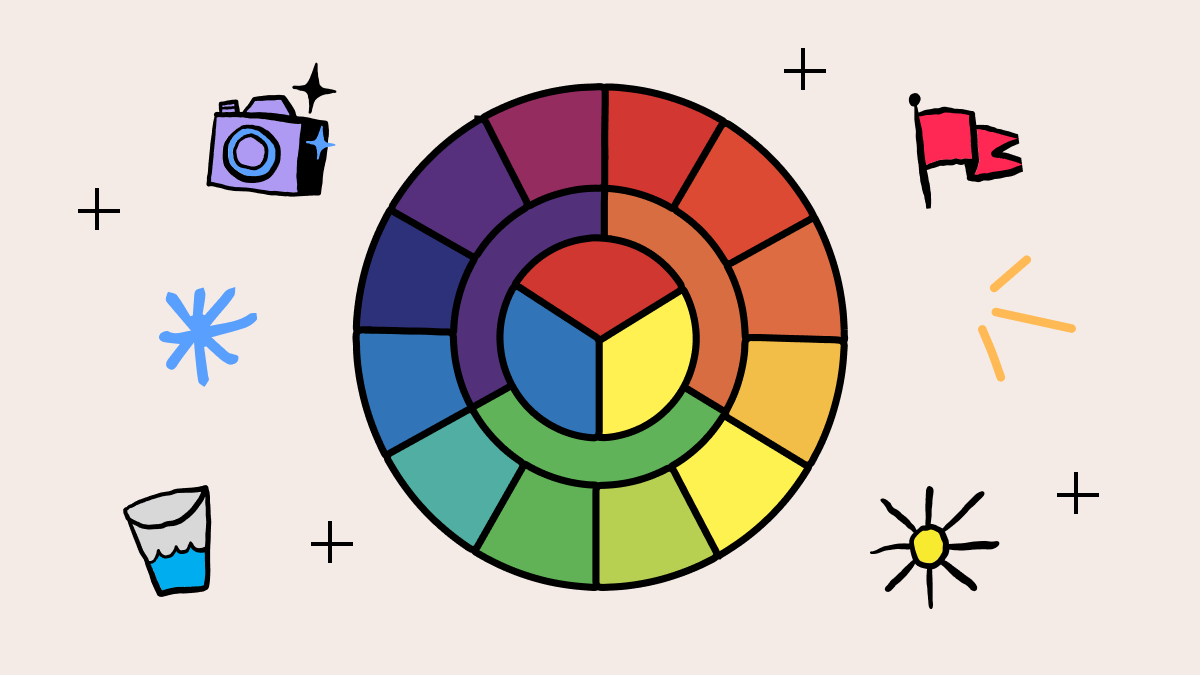
The first step to understanding color theory is to gain an understanding of the color wheel. The color wheel is made up of primary, secondary, and tertiary colors, and is used to show how different colors relate to each other, how they can be combined, and what “opposite” shades are.
Choosing a color palette starts with a good understanding of color theory and the color wheel. Your color palette should embody your brand’s personality through the shades you’ve chosen, easing your audience into feeling a specific way simply through the colors of your branding.
"It's amazing how colors can truly impact our mood and influence our behavior," says Rachel Goldman, PhD. And this is true. There are plenty of colors that are associated with specific emotions. A 2020 study found that, of 4,598 people from 30 countries:
- 51% associate black with sadness
- 43% associate white with relief
- 68% associate red with love
- 35% associate blue with relief
- 39% associate green with contentment
- 52% associate yellow with joy
- 25% associate purple with pleasure
- 36% associate brown with disgust
- 44% associate orange with joy
- 50% associate pink with love
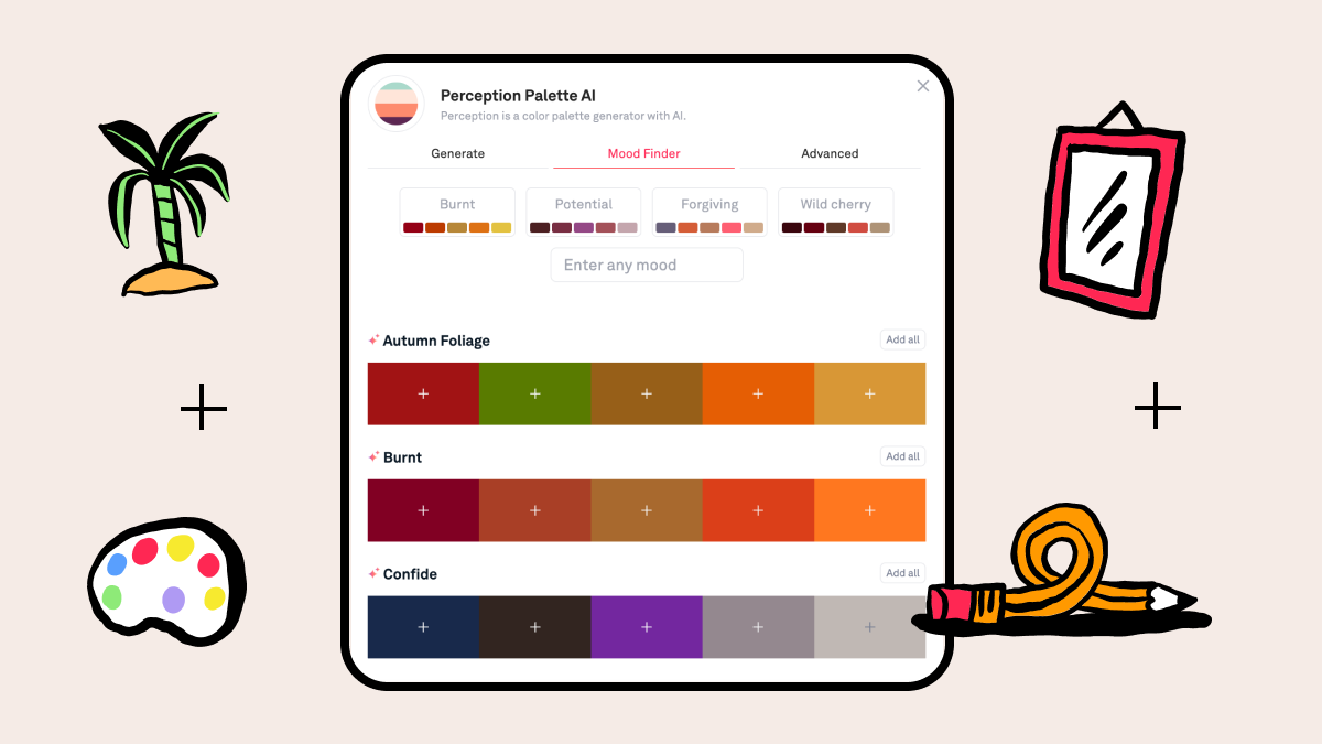
So choosing the right shades is crucial to getting your message across effectively. The greatest brands are made from matching personalities to color palettes. You can utilize the Perception AI add-on to quickly discover your brand colors. Simply input your ideal brand personality (“sophisticated, quirky, fun”) and see what shades Perception AI offers.
5 steps to picking a color palette for graphic design
Now you know about the theory behind a color palette and how it can affect your audience, you can begin choosing your brand shades. It’s not just a question of choosing a few different colors that you think look nice together — there are a few considerations you should be aware of.
Step 1: Define the purpose and mood of your design
As discussed, different colors evoke different emotions. Knowing what mood you want to portray within your branding is crucial to choosing the right color palette, as you can choose the right shades and hues to draw these feelings from your audience.
Pick out a few emotions, feelings, and personality traits that encapsulate your brand as well as your target audience, and match these to broad shades that can fit into your color palette.
Step 2: Research and gather inspiration
Inspiration can come from anywhere. Whether it’s a brand you like the look and feel of (even if it’s not within your industry) to being out in nature and the mood it brings, take inspiration from anywhere and everywhere.
If you’re feeling stuck on ideas, there are plenty of platforms and websites available to gather inspiration from. Our very own Playbook Color AI can help you create a brand new color palette, powered by AI and color theory. This level of inspiration and research gathering is made even easier with Playbook because you can scan through various inspirational boards that are already live. Our “State of Creative Digital Asset Management” report found that 83% of users believe visual browsing is the most important feature of a digital asset management (DAM) platform.
Alternatively, you can draw inspiration from Pinterest boards, which can help you capture a particular aesthetic. Another one of our favorite platforms to use for inspiration is Dribbble, which allows us to draw inspiration from other graphic designers out there.
Step 3: Select a base color
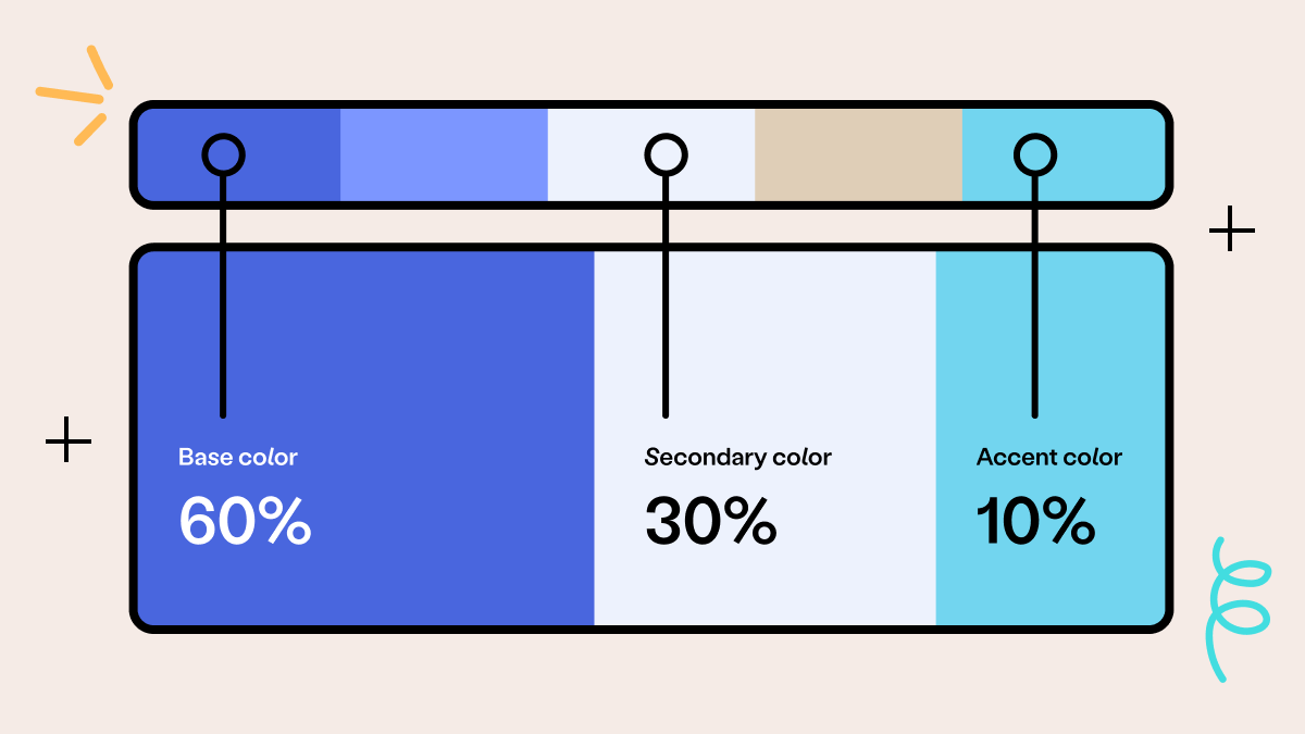
The first step to creating a color palette is to select your base color. This will be the shade that’s most prominent, and should make up around 60% of your designs. The rest will act as secondary and accent shades.
This dominant base color should be reflective of the overall mood you want within your audience, so make sure you choose it carefully so that it fits in with your brand personality and identity.
If you’re feeling stuck for color ideas, try Playbook’s AI Color Palette tool. Simply input the feeling, word, or phrase that’s closely aligned with your brand and generate a mood-based color palette.
Step 4: Choose secondary and accent colors
Once you’ve selected your base color, you can move onto curating the rest of your color palette. Follow the 60-30-10 rule when curating your color palette, which says that, after your 60% base color, 30% of your color palette is made up of your secondary shade, while 10% is used for accent colors. Even if your palette has more than three shades, following this guide will allow you to keep things in balance for your viewers.
Choose shades that complement your base color and which work well together. It can be a shade that sits next to it on the color wheel, or may be a completely different shade — you have the freedom to choose the shade, as long as it fits in with your brand aesthetic.
Step 5: Test your color palette
Once you’ve chosen your shades to sit in your color palette, you can test them. It’s important to test color combinations so you can see exactly how the shades look together. Colors can affect how users interact and navigate around your website, so it’s important to test out where the shades will sit and how it all looks together. For example, you may find that the shade you’ve chosen for your font doesn’t actually work well when on a web page. Similarly, an accent shade may not show up as well on certain aspects of the page, which can make it difficult to spot on a website.
Testing your color palette whenever you change or update it is crucial to make sure your design stays effective and appealing to your audience. You may even want to use the designs and test it amongst a small group of users, who can then provide feedback about what works about your color palette and what may need some adjustments.
Color picker from images: How color palette generators can help
Even with all the tips we’ve given, creating a color palette can be difficult. We know how much time and effort is required to curate the perfect palette for a brand or design — and we’re here to help.
The Playbook Color Palette generator uses AI to generate color palettes with a simple word or phrase. You have the freedom to mix and match your own shades with AI recommendations, if you have a particular shade in mind.
Take it a step further and create moodboards to present to clients or stakeholders, to help them see your creative vision through inspirational images and artwork.
Pick the right color palette every time with Playbook
We understand how much time can be spent searching for and creating your ideal theme. That’s why we’re working on making this process smoother and faster for designers everywhere with Playbook’s Perception AI integration.
Based on color theory and powered by AI, simply enter a prompt or upload a photo or moodboard, sit back, and let Perception build sophisticated, professional color palettes in seconds.
Playbook automatically saves every version of your prompts and colors so you can come back to them any time. And with 4TB of free lifetime storage, you’ll never have to worry about running out of space.
Sign up for a free account and never get stuck on picking a color palette again.