Chrome effects give the impression of a shiny, metallic finish on typography, logo designs, poster designs, and more to produce a cool retro effect that works whether you want to recreate a 1950s-style Grease aesthetic, an 80s throwback vibe, or a futuristic sci-fi look.
Chrome effects have been growing in popularity since 2019, driven partly by the influence of Chrometype, an Instagram page dedicated to all things chrome art with over 130,000 followers.
So what’s behind the chrome comeback? A few factors have helped this style retain its popularity over the years — for example, the metallic, shiny aesthetic of chrome can transport the viewer through time, as it’s effective for creating both retro and futuristic looks.
Additionally, chrome effects can make your designs more dynamic and visually appealing by adding depth and dimensionality through the use of gradients, shadows, and highlights that mimic the way light reflects off a metallic surface.
Plus, chrome is a super versatile tool that’s easy to customize for different styles and color palettes since you can play with the saturation, hue, and other properties to create the desired effect.Creating cool chrome effects in Illustrator is relatively easy, even for beginners. In this Illustrator tutorial, we’ll walk you through 11 steps for creating chrome text effects using Adobe Illustrator.
Creating chrome effects in Adobe Illustrator: 7 easy steps
Use the following steps to create a chrome effect in Illustrator.
Step 1
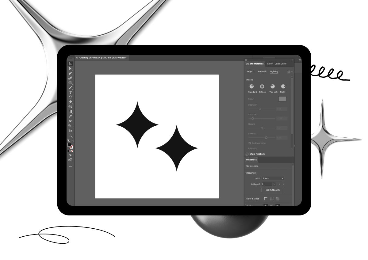
Open Adobe Illustrator and create a new document.
Step 2
Draw the object that you want to apply the chrome effect to. This could be lettering, a shape, or an image.
Step 3
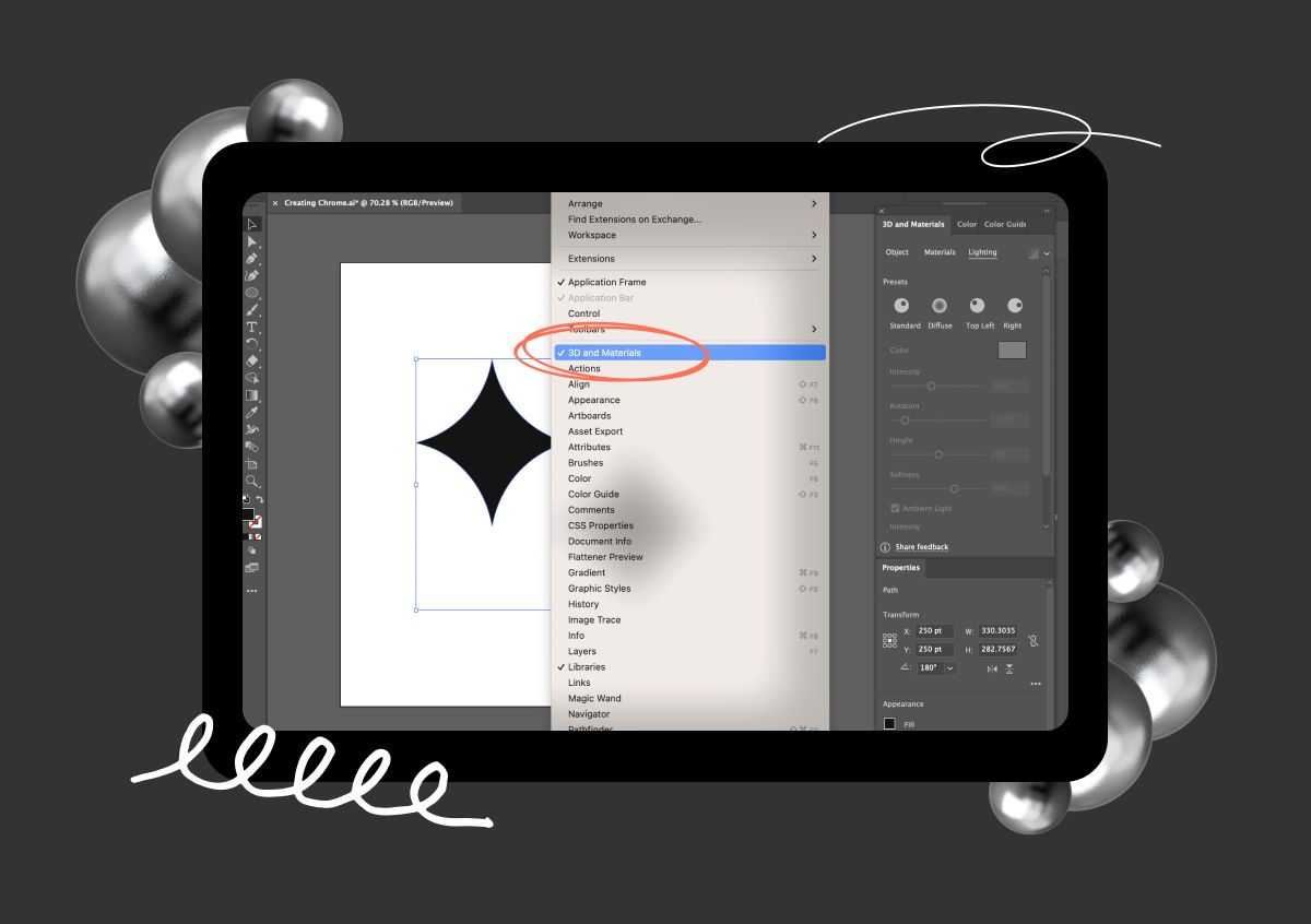
Select the object and go to the 3D and Materials panel (Window > 3D and Materials) and click on it to make sure it’s added to your panel.
Step 4
Select the object, then go to the Appearance panel (Window > Appearance), and choose Gradient.

Step 5
Select the object and click on Inflate to add depth.

Step 6
Go to Materials > Base Properties and adjust the metallic option to your preference.
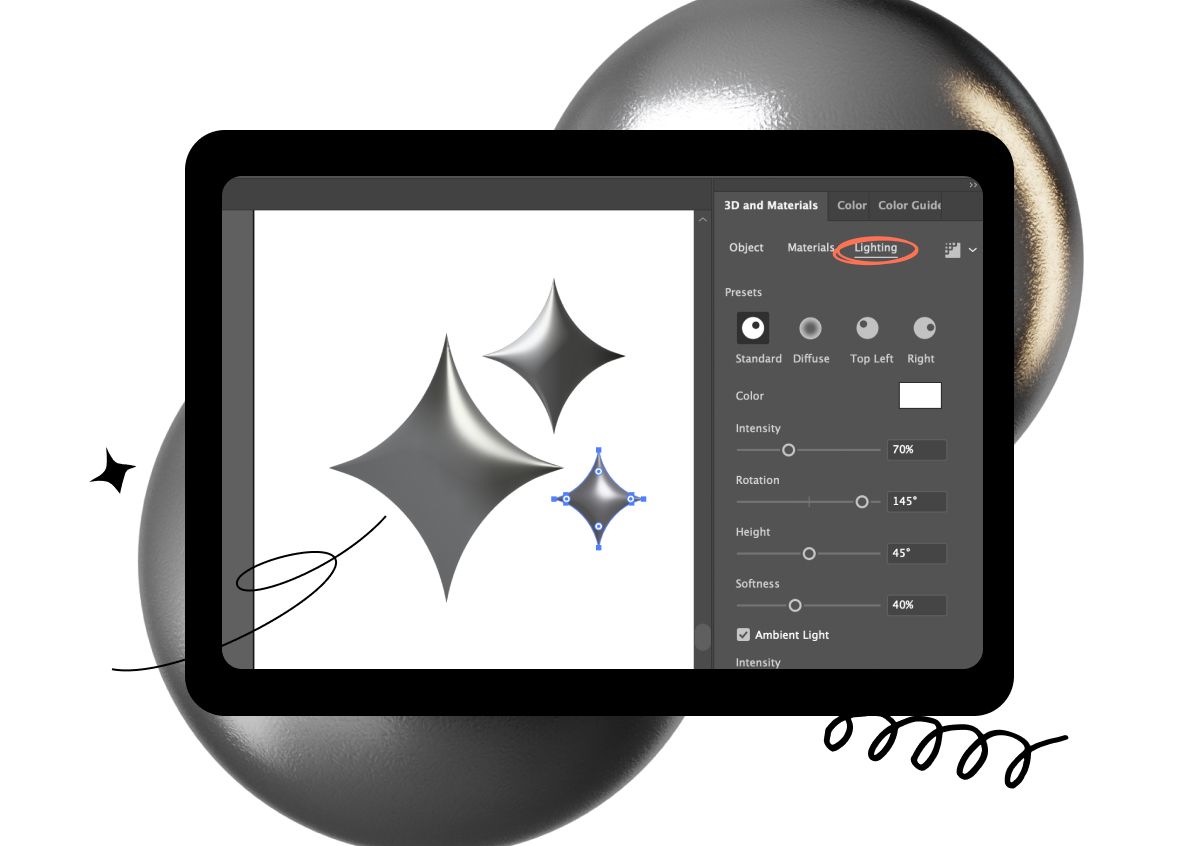
Step 7
Adjust the angle and position of the gradient to create a reflective look on the lighting tab, and you’re all done!
Adding textures and details
That’s all it takes to create your first chrome effect design! But what if you want to take it further? Chrome effects look pretty damn cool on their own, but adding texture and other details, such as filters and gradients, can take your designs from “okay” to “wow!” in the following ways:
- Realism: Adding textures can help create a more realistic depiction of chrome in a design by mimicking how light reflects and refracts on the surface of metal.
- Visual interest: Adding textures or filters to a chrome effect can give depth and complexity to the design, making it more appealing to the viewer’s eye.
- Differentiation: Textures can differentiate your designs from others that use chrome effects, making them stand out and capturing your viewers’ attention.
- Creativity: What you can achieve with chrome effects is only limited by your creativity, so get experimenting to create unique chrome effects that reflect the brand or message you’re trying to convey.
Mistakes to avoid when creating a chrome effect
Before you get too trigger-happy with your chrome effects, you need to be aware of the pitfalls to avoid that could inadvertently ruin your design.
1. Overuse of reflections
One of the biggest mistakes designers make when creating a chrome effect is overusing reflections. While chrome is a reflective material, being too heavy-handed with reflections can make the design look unrealistic and distracting.
Using low-quality textures
Using low-quality textures can make the chrome effect look cheap and unprofessional. It’s essential to use high-quality textures that are properly scaled and positioned to ensure a polished effect.
Incorrect lighting
Lighting is a critical aspect of creating a convincing chrome effect. If the lighting is wrong, your chrome effect may look flat or dull. Experiment with different lighting setups to find the one that best showcases the chrome effect.
Over-reliance on filters
It can be tempting to use filters to create a chrome effect, but it can also make your design look generic and unoriginal. Use a combination of techniques, such as layer styles and manual adjustments, to create a unique and convincing chrome effect.
Ignoring the surrounding environment
When designing a chrome effect, consider the surrounding environment and how it will impact the appearance of the design. Reflections from surrounding objects, the color of the background, and the lighting in the environment can all alter the overall look of the chrome effect.
When in chrome…
Now it’s over to you to start creating your own chrome effects with Adobe Illustrator — if you’re feeling stuck for inspiration, check out this post on maintaining a steady supply of creative design ideas.
Of course, you’ll need somewhere to store all your amazing chrome creations that provides all the storage space you need and allows you to intuitively browse and share your work. Somewhere like Playbook — the online storage platform by designers for designers.
Creatives receive 4TB of free lifetime storage on our Artist + Designer plan, plus access to our portfolio templates that make it easy to create a stunning online presence. So what are you waiting for? Sign up now and join the Playbook revolution.

