Scott Balmer is a freelance digital illustrator with a soft spot for science fiction, as well as an extensive, international client list ranging from magazines and newspapers to art galleries and album covers. Read on to get a glimpse at his artistic evolution, future goals, and advice for other freelancers.
What has been your experience as a freelancer? Did you always know this was going to be your career path?
My first job was for The Guardian's Family section, and the page real estate was fairly small to make my work. Alongside that, I was using an illustration portal website that was sort of like a digital postcard to promote your work. From that came my second illustration job, for Inc Magazine, the US publication. I was taken aback by that because you always hear, like, “Start in your own country and then branch out.” It was so out of the blue, but I must have been doing something right if an international company noticed.
In the UK, usually it's been that if you wanted to get big in magazines, newspapers, books, publishing, whatever, you'd have to move down to London. But I think with the internet and stuff like that, it kind of changed. For freelancing, I don't think it really matters where you are these days.
Has the pandemic had any impact on the type or amount of commissions you’ve received?
Yeah, when lockdown hit mid-March last year, all of a sudden it was like poof, and everything was shutting down. It was funny, because just before March I was sending postcards to people, so I'm putting them in envelopes, and I'm licking them, and I'm thinking, There's a bloody pandemic going on, and I'm licking these bloody things.
It did affect me for a chunk, because nobody knew what was going on. I mean, people were going to work from home, creative managers were furloughed, it was just a weird time. I managed to get through the pandemic with some commissions, but otherwise you’d be looking at companies wondering, like, Should I contact them? And if I do contact them, are they gonna be there?
But a few things did come out of it. The software company Affinity reached out to me quite early on for 100 Days 100 Commissions, and I worked with them again, actually, after all that, and was interviewed by them.
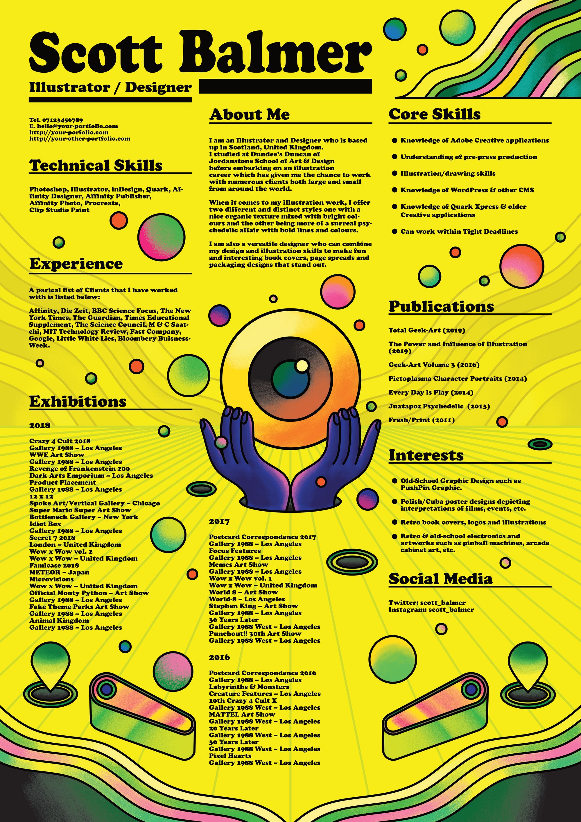
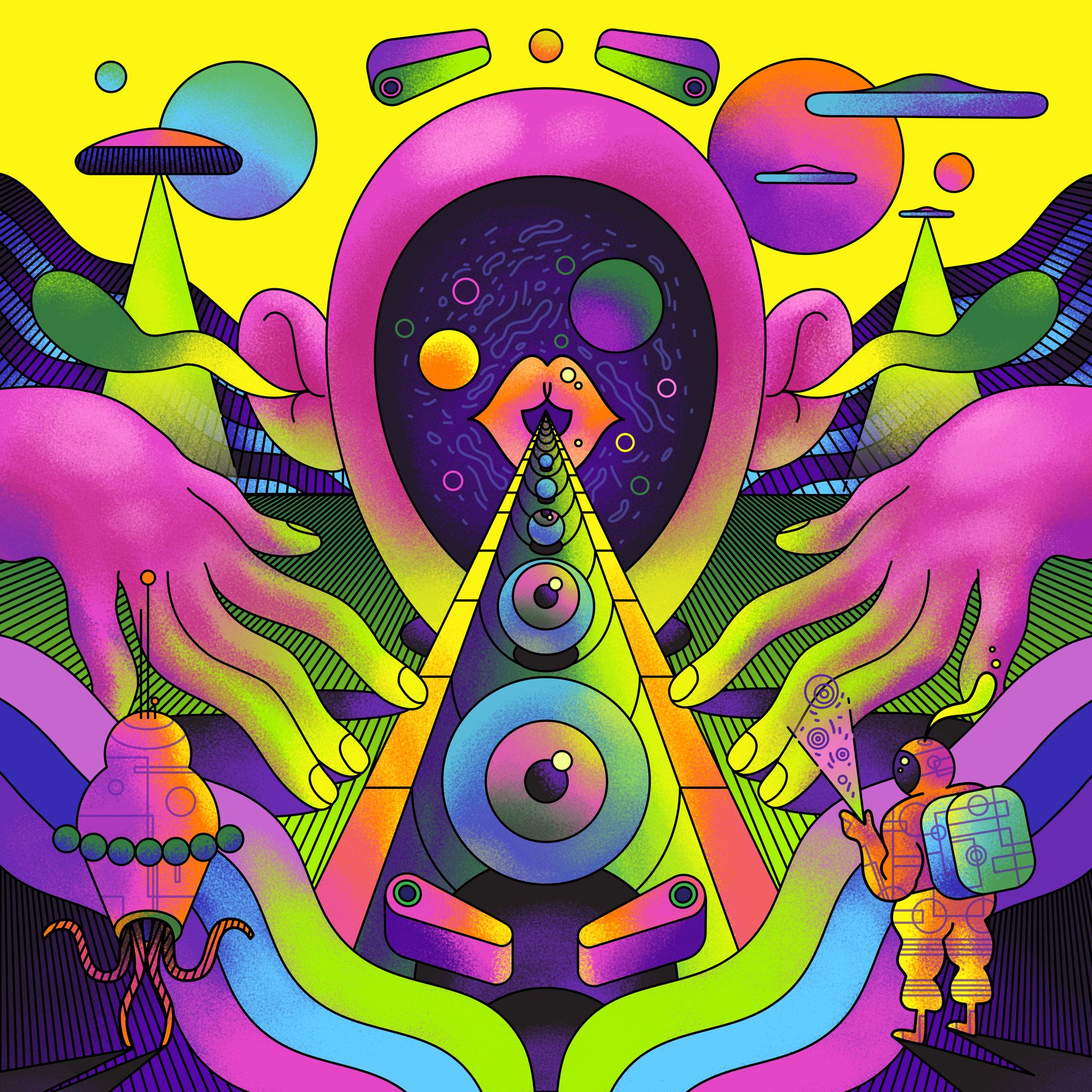
I also got contacted by the Chinese branch of HONOR Global, which was interesting. The brief was to make a creative CV aimed at young creatives. I had to film myself using one of their laptops, and also had to do a screen capture of me working on the CV, which was something out of my comfort zone. I mean, usually when it comes to making stuff, it’s for me or it’s for a company, so nobody needs to see the behind the scenes stuff. So I really had to get in that zone and get it down to a fine art. It was insightful in that way. I would do it again.
How do you balance your time between projects?
Preferably, I would rather do one thing after another if I can, so I'll send one thing, then I'll work on something else, but if that's not done then I could work on something else. I don't want to get to the situation where I have about three or four things I'm doing at once, because time-wise it would be a lot in a day. So I'll get that done that day, that done the second day or whatever.
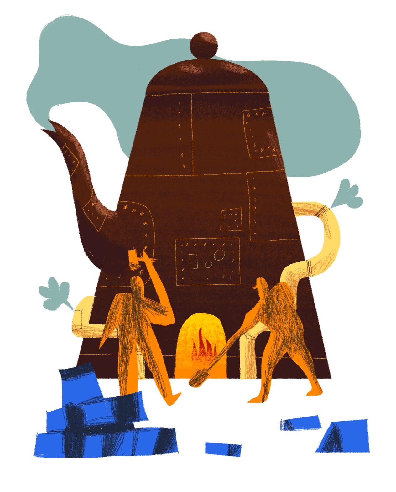
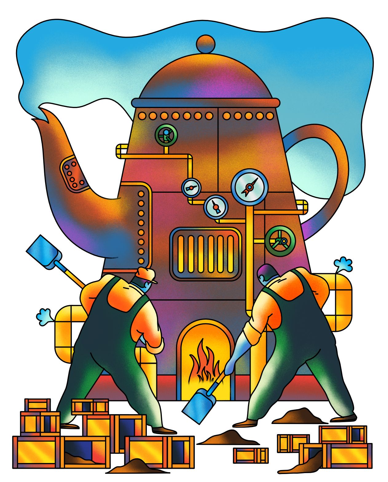
I'm going to be honest, I used to not bother with roughs. Years ago, I used to be all about doing rough sketchbook stuff, then when I was at art school, it was like, Oh, you want me to do this? There you are, there it is, it's done. And it would be fine. But once I finished studying, I realized you can't just say, Trust me, I'll make you something nice to people paying you. It’s great to get right into making the stuff, but then you get the problems that come with it. If something's not working, you’ve got to be able to go back and figure it out. You want to look at it and know how you did that.
I use an iPad for roughs, so I don't do black and white, just color. Color is an important part of my work, regardless of what style, so I usually think of the color first, then work towards what works well with that color. And I'm not precious about that—I've actually posted my roughs onto LinkedIn and Twitter. You don't need to make them pretty, you need to make them so people can see what it is you're trying to convey.
It reminds me of one of the writers on The Simpsons, John Swartzwelder, he talked about writing the scripts and said he just writes a lot of rubbish and then goes back when he’s done and tweaks it. It's exactly the same with anything creative: it starts off bad, and then you’re making it better. I think confidence is what it boils down to—as long as you're confident with what ideas you're giving, then that's half the battle.
Looking at your work, you have two very distinct styles. Do you have a preference for either? How did you come to have such competing styles?
When making my website, both styles actually existed in the same place, and I thought, No, I need to separate these, because people are going to see these radically different things and think it’s disjointed and kind of weird.
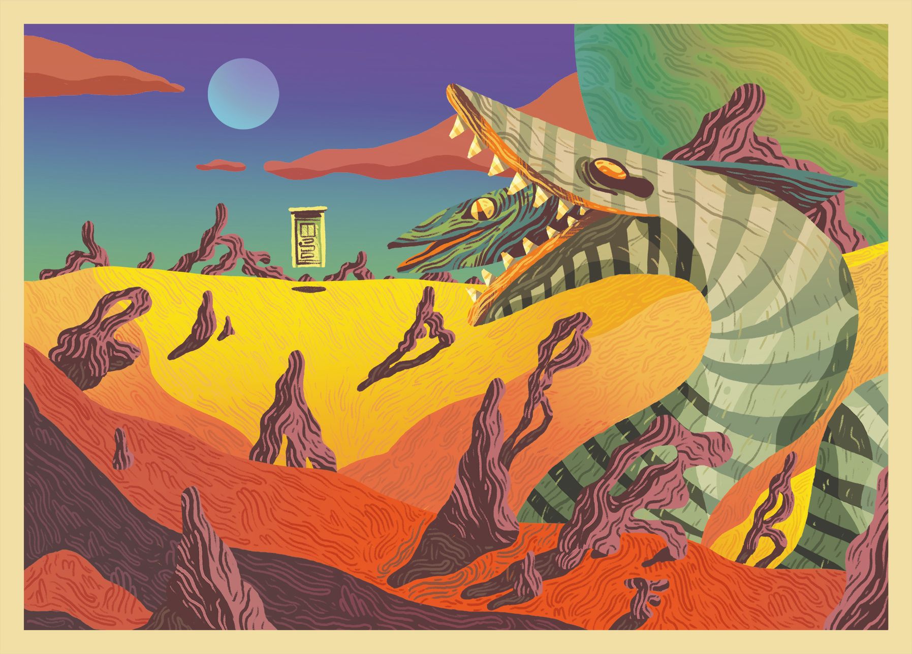
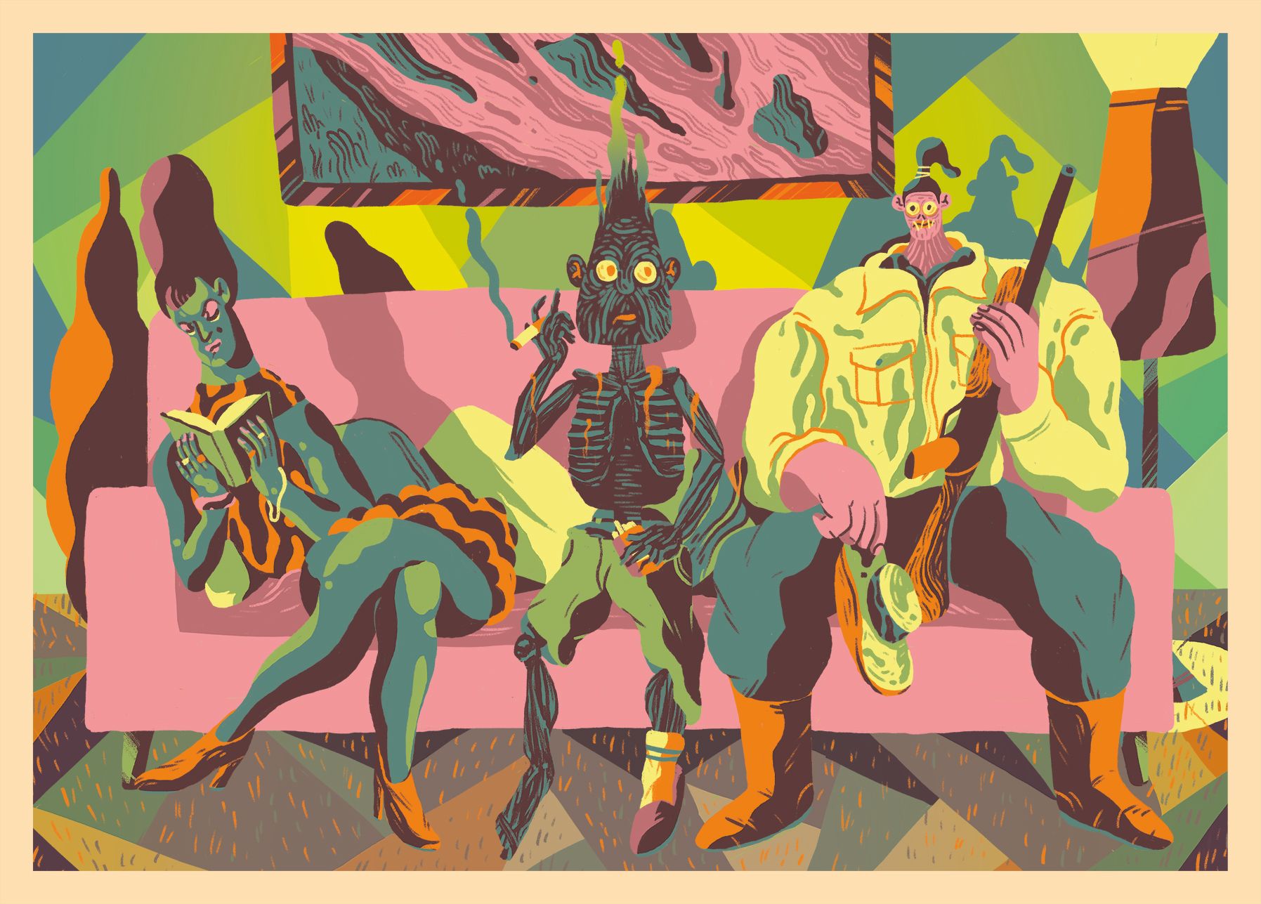
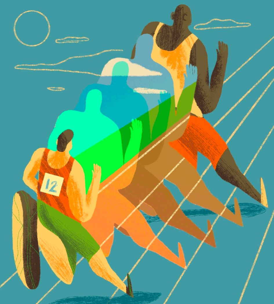
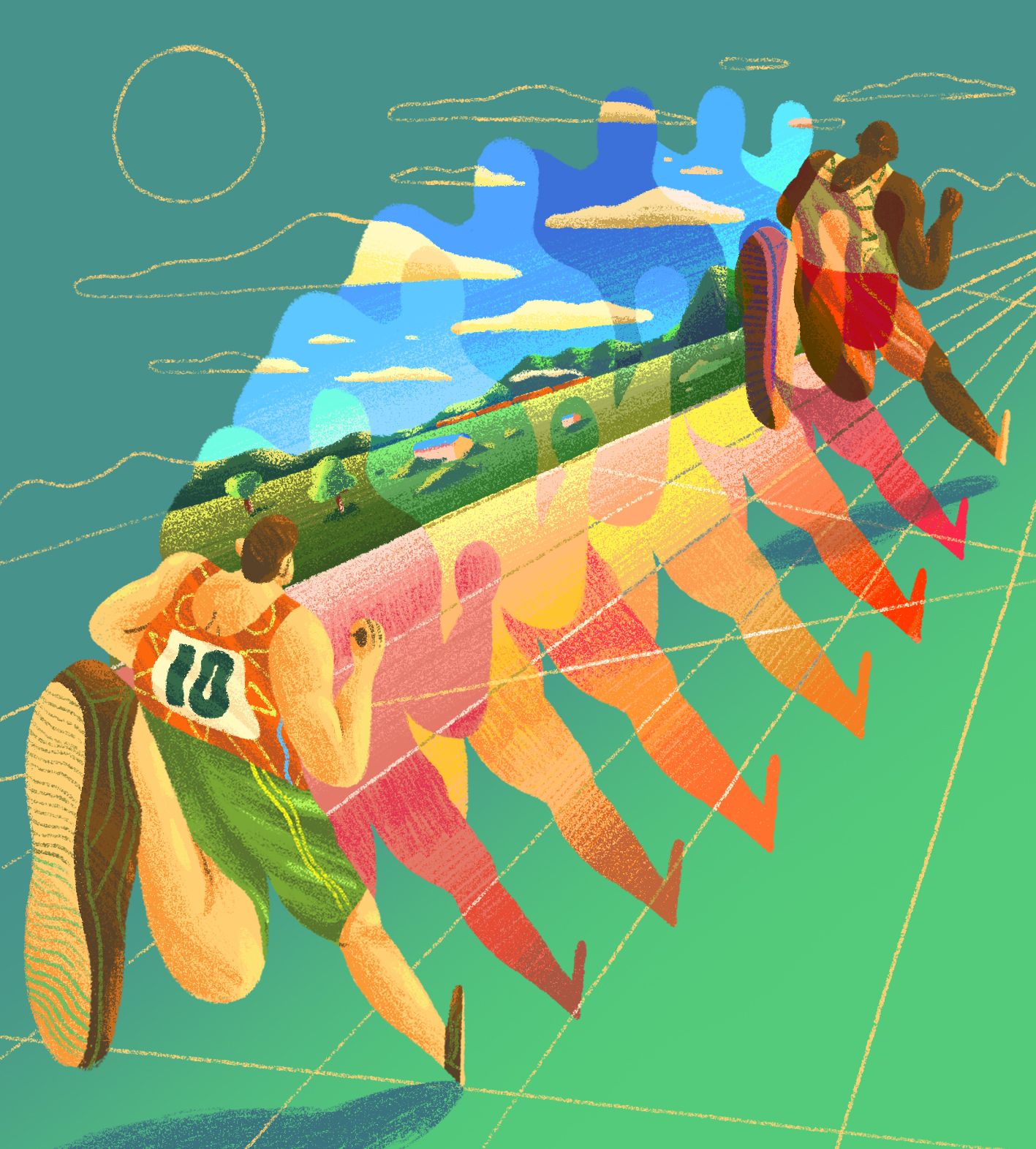
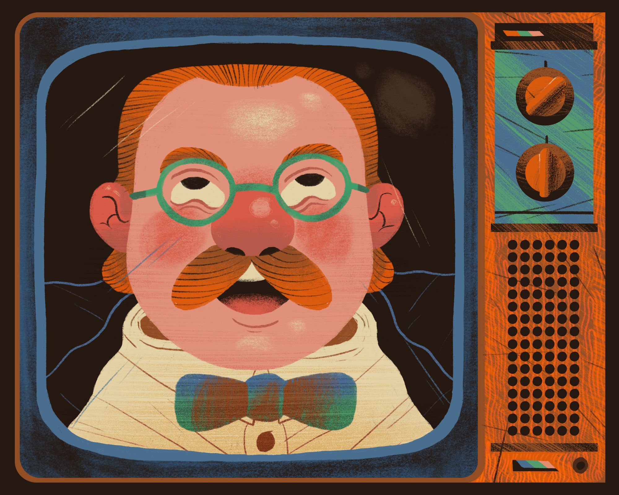
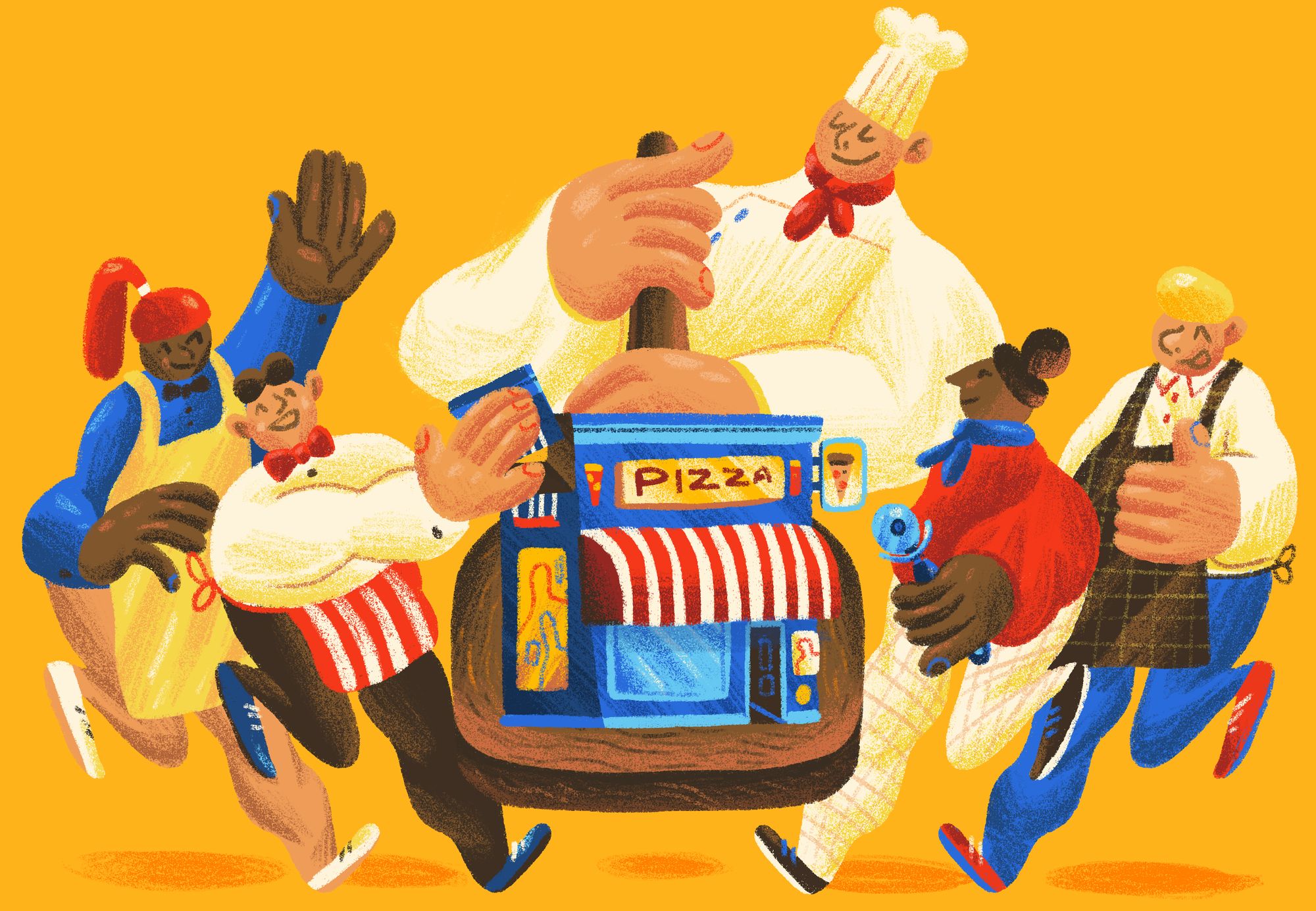
In some ways they're similar, because in terms of roughs, I do them the same way. But the first style, with the soft texture and pencil shading and stuff, evolved from a fair bit back, maybe four or five years ago, when it was basically just shapes in Photoshop. So it had more angular stuff that had shadows and shading with the eraser. And one day, I just looked at it and thought, This is too graphic, maybe I need to loosen up a wee bit. And it evolved into that style, which is a bit more friendly, a bit more open; it's a naive style.
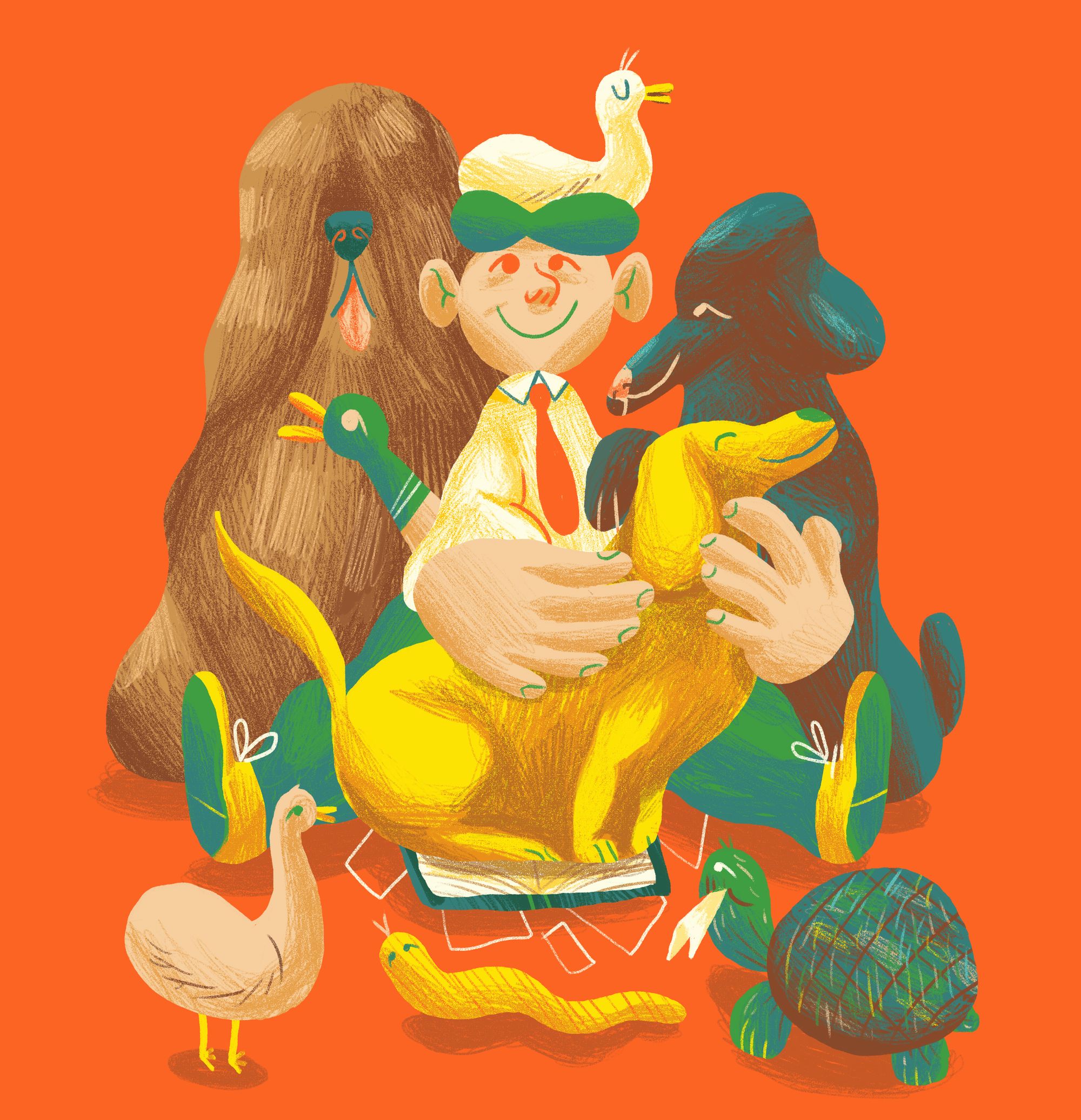
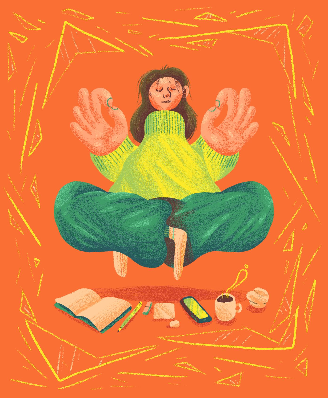
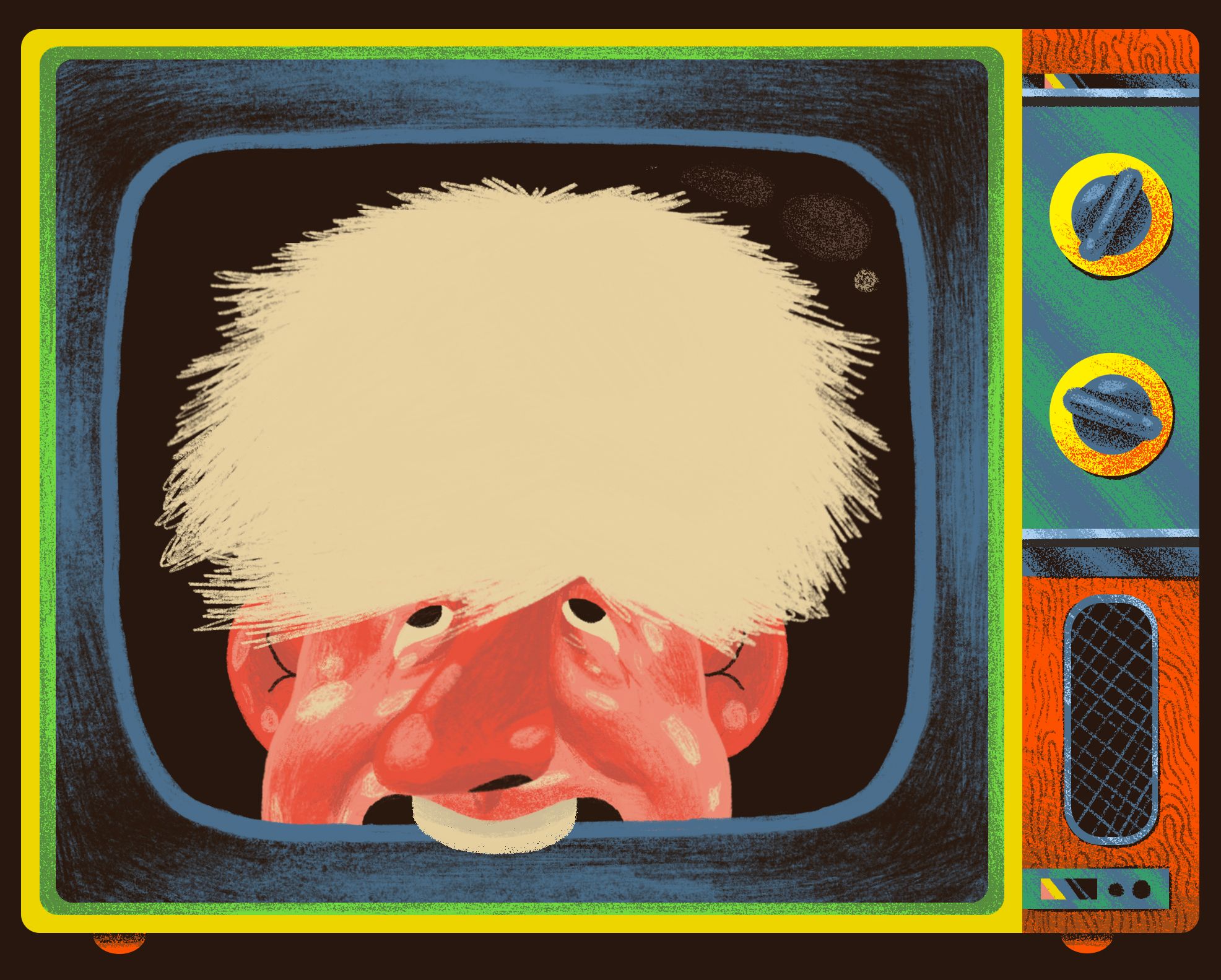
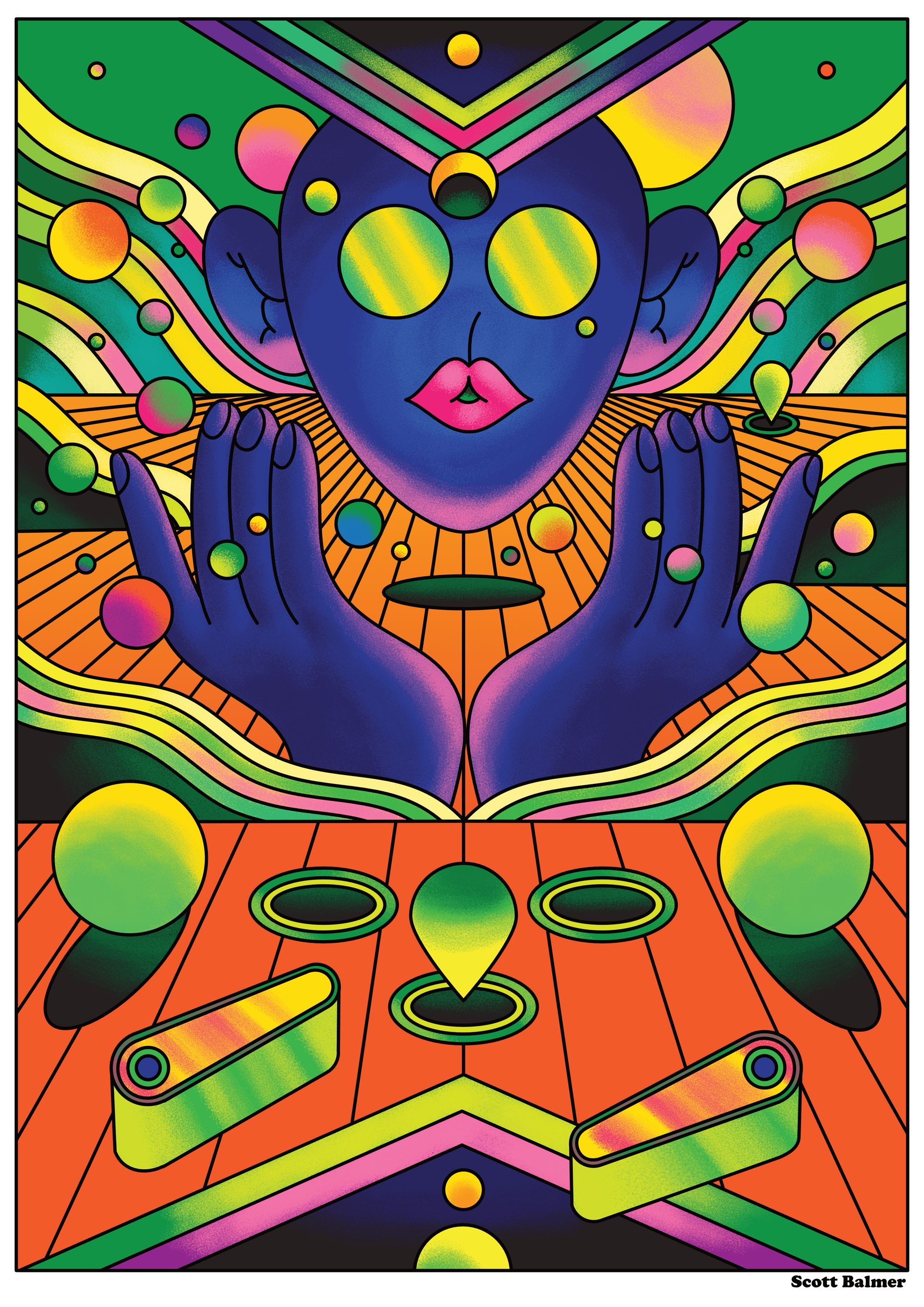
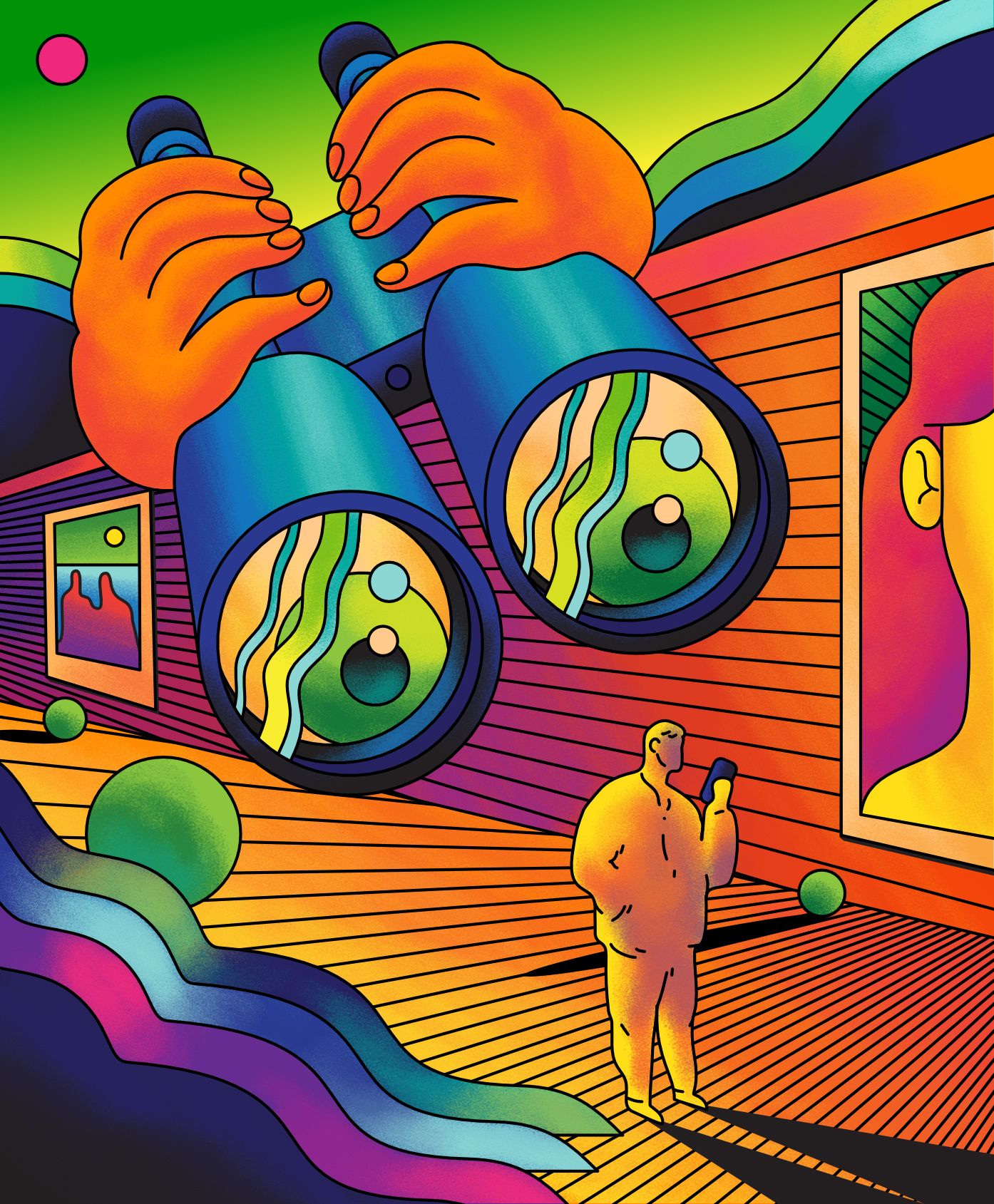
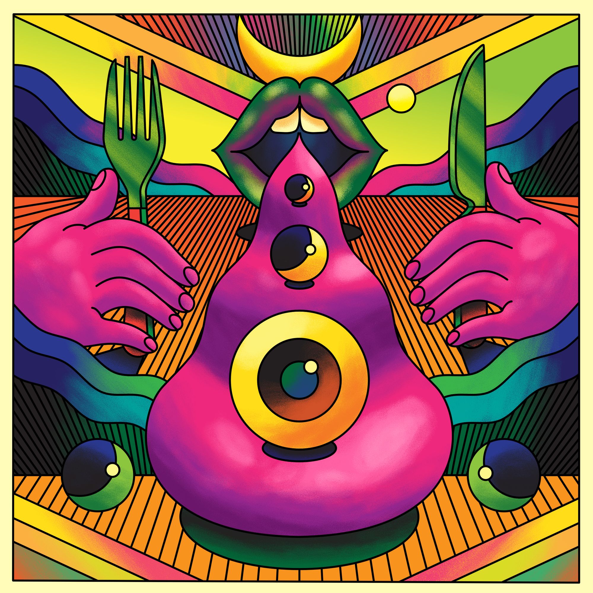
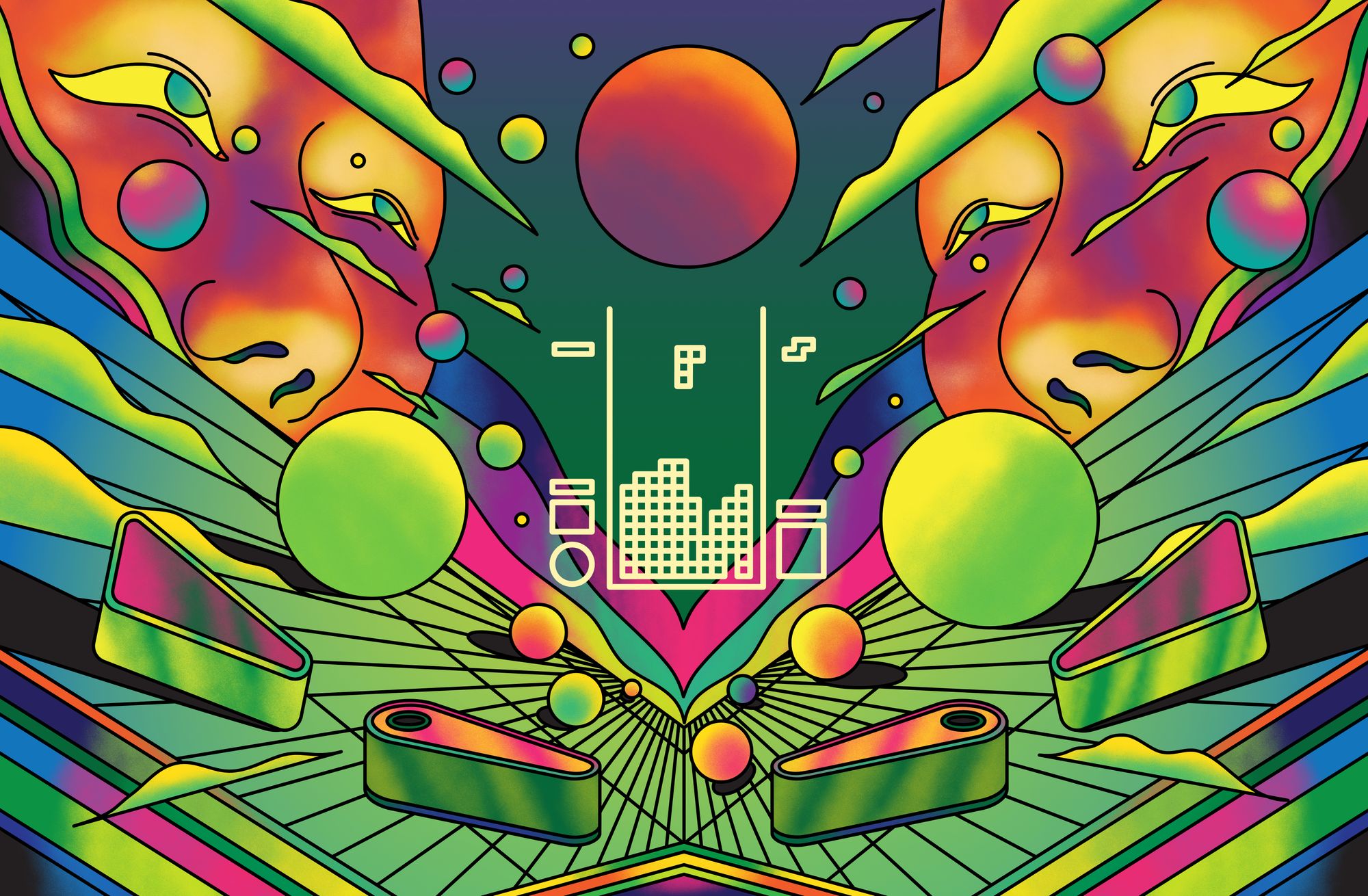
The other style was a kind of evolution, as well. Years ago, a lecturer said to me once that I draw quite old-fashioned because it looked like something out of the 60s or 70s, you know, patterns and stuff like that. And at the time, I was doing a lot of printmaking, so doing patterns and stuff actually works well. When I revisited it later on, it kind of started off as me just doing very stripped back illustrations, very minimal with as little line work as possible, while still getting across the message. And then it evolved to what I'm doing now.
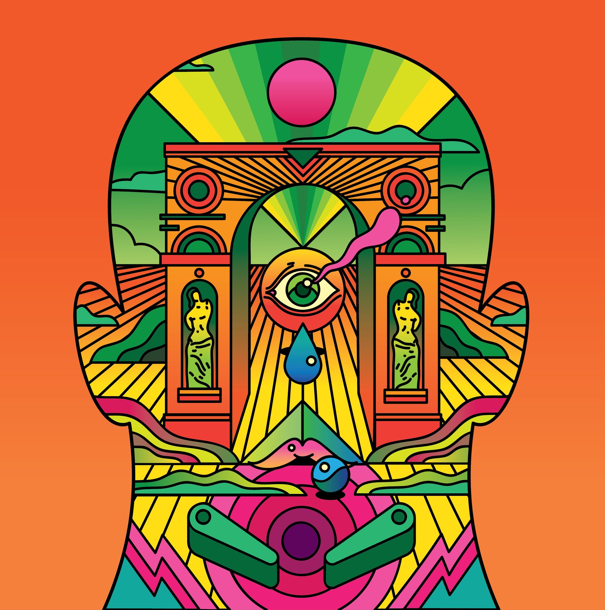
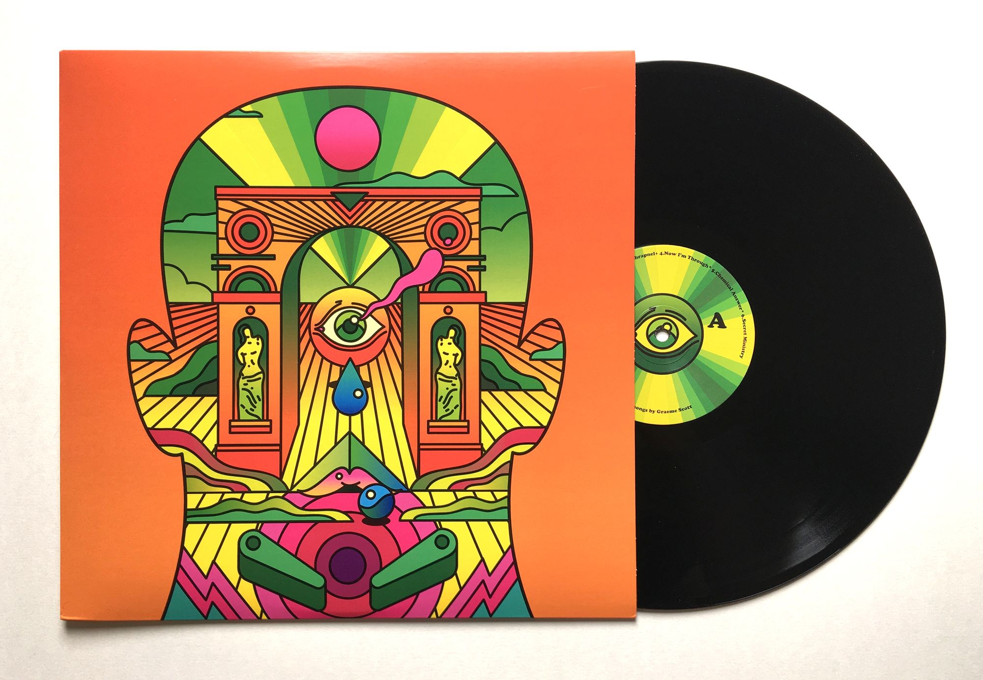
There was an illustration that's probably the turning point for it. It was a charity thing for an album cover. A local university lecturer contacted me out of the blue; his friend Graeme Scott had died, and he wrote music and he had an album he never released, so he wanted to get it made as a tribute to him and give the money to an anti-suicide charity, Brother in Arms. The artwork was a silhouette of a head, and inside the head was this weird landscape with this neoclassical arch, and the eye was a tear. It was weird and surreal, but it fit the type of music he made. So that was a turning point.
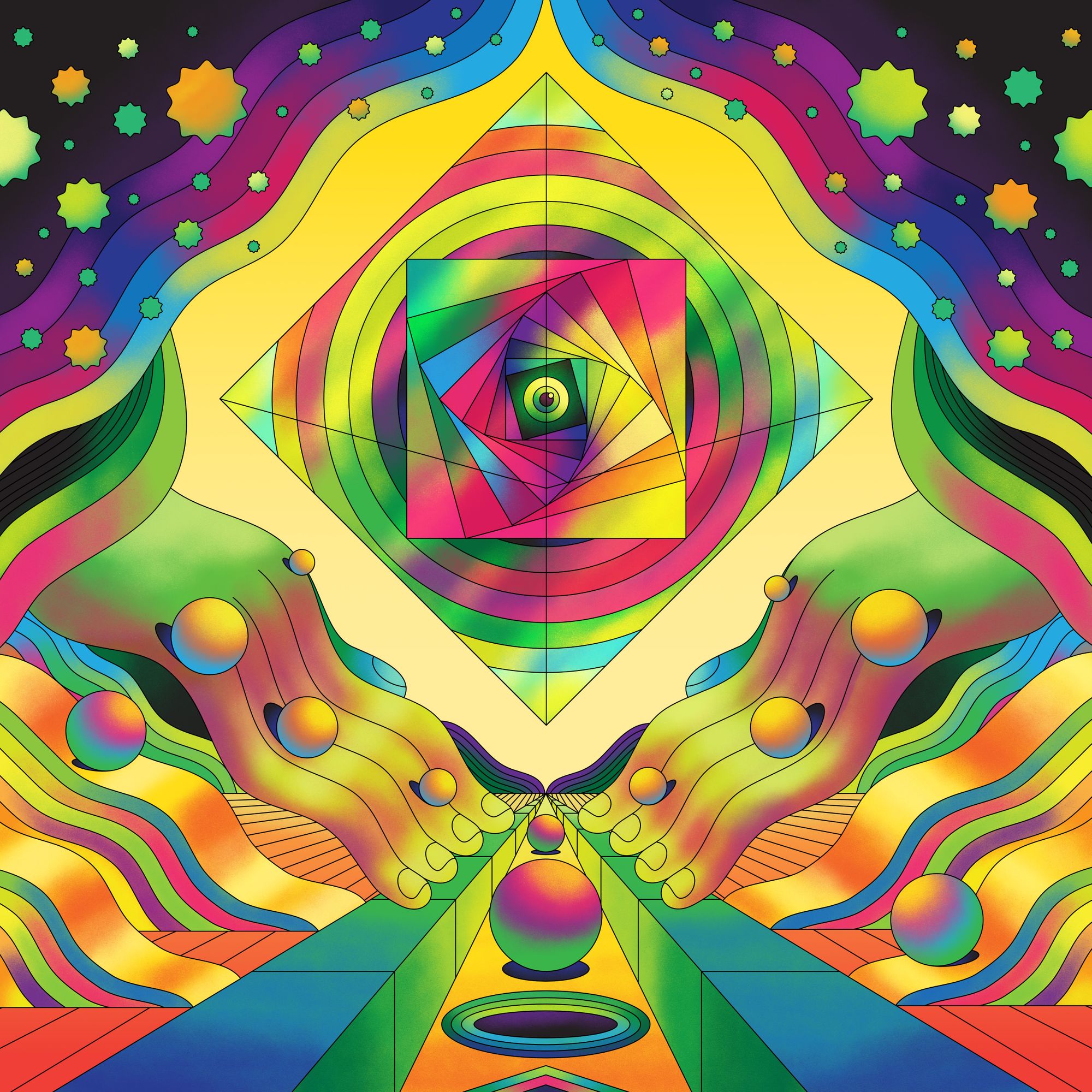
And after that, I started experimenting with Affinity Designer, just painting inside vector shapes, and it was just seamless. I've kind of gone a bit mad with it.
I had a collaboration with another illustrator this year, and we were working in different apps, so the file I sent him turned out really small. So he just extended it, and it was amazing. Most of the time, I was using thicker lines, but the artwork came out with thin lines. It was a happy accident, we were both chuffed with how it turned out. It doesn't matter what stage you are at, sometimes a happy accident is just an amazing feeling. It makes you realize that you're still learning.
What’s your dream project?
Years ago, when I was a kid, there was a science magazine called Omni that always fascinated me when I saw its covers. They literally had some of the most out-there covers. Sometimes you look back at old magazines, not just this one, and you see some really weird illustrations for mundane topics, like I remember seeing one of these lizard people, and it was for filing your tax return or something. And I was like, That's what I want. I want to do stuff like that. I mean, it stands out, and that's what illustration's supposed to do.
What tips do you have for freelancers keeping up and growing a social media presence?
I would say if you're going to do freelance, don't give up too early. A lot of people do, but the thing is, it's all confidence. You don't need to be really confident, but you’re best to just apply and see what happens.
Target your stuff, know your work. You don't need to know your limitations, you just need to know where it would fit; you never know if someone or some company might just hire you.
And don't be afraid of failure. You know, people are always afraid of failure, but it’s the only way to learn and it's the only way to move forward. Failing doesn't mean there's anything wrong with you, it just gives you the opportunity to find some place where you do fit in.
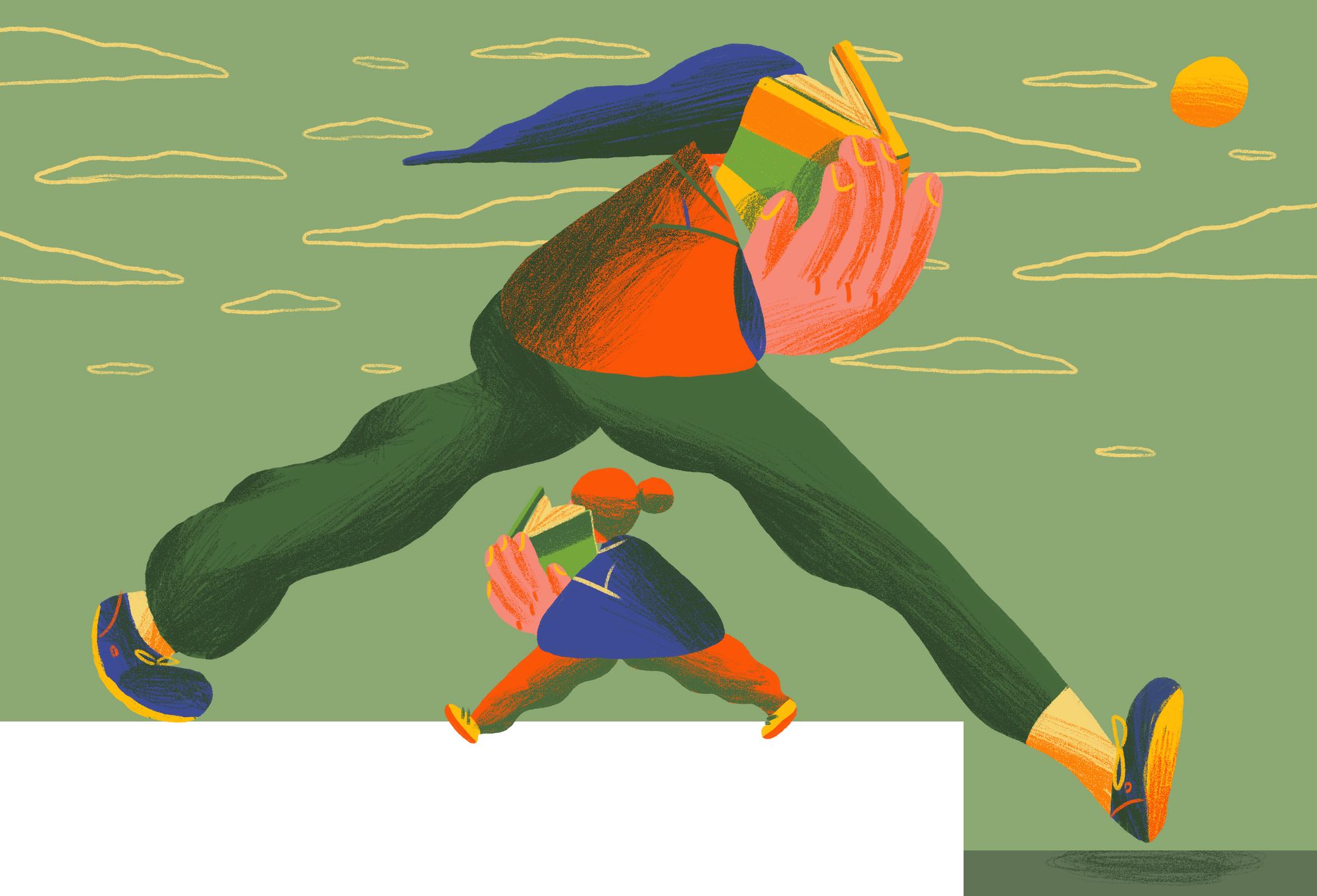
Scott has 2 websites for his illustrations: http://scottbalmer.co.uk/ and https://scottbalmervectors.co.uk/. He is also on Instagram, Behance, and Twitter.
